Sangyup Kim
Philadelphia‐based Graphic Designer
- 2026 Pasa Conference, Conference Identity
 Cultivar Communications, Brand Identity
- Pasa Sustainable Agriculture, Brand Refresh
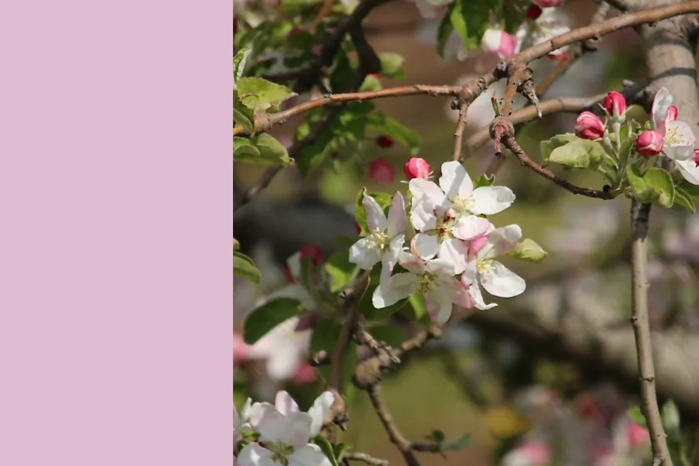
- Pasa Conferences, In‑house Visual Design
- Scars Uncovered, Brand Identity
- I’m Blue, Exhibition Identity
- African People & Wildlife, Iconography
Works
About
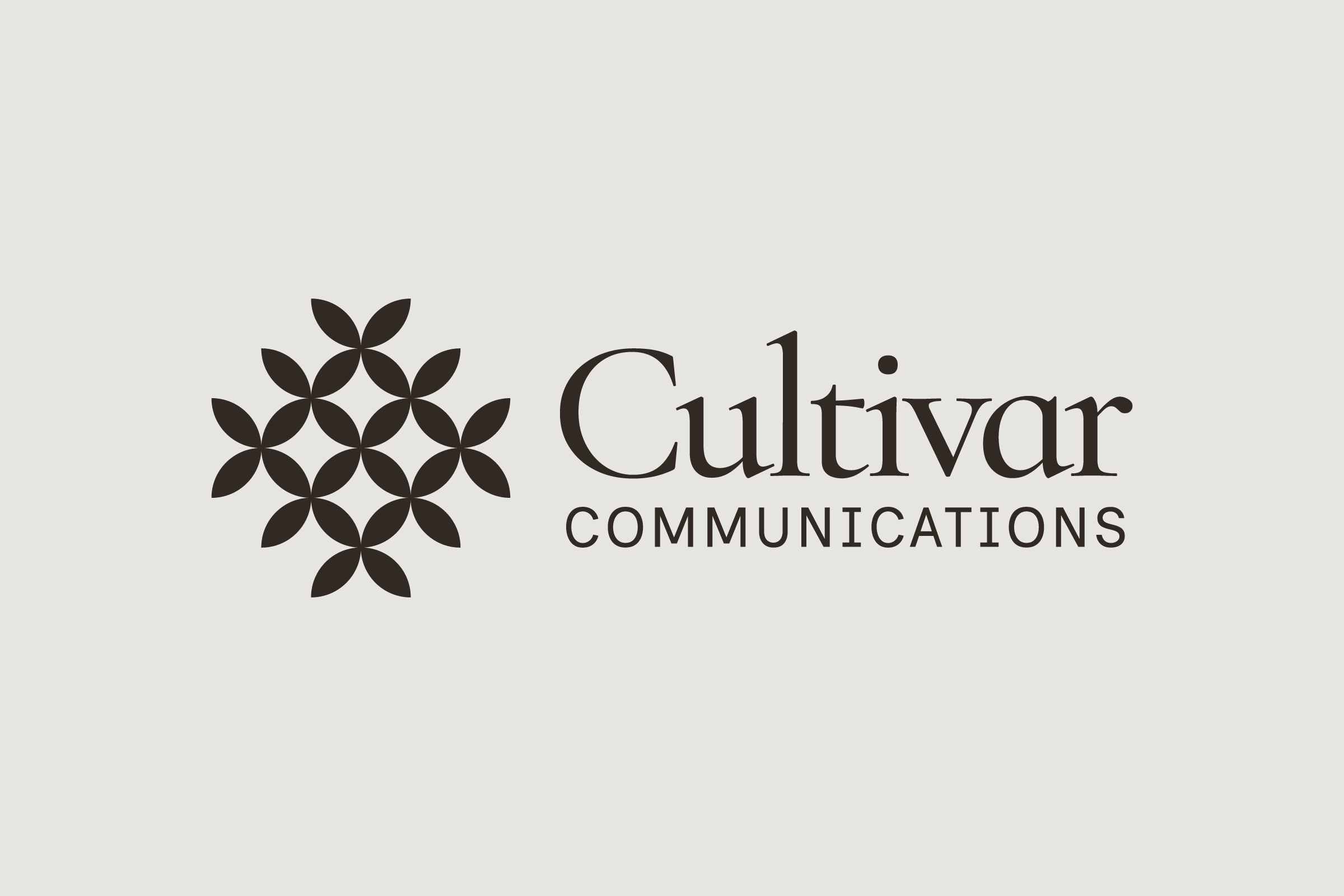
Cultivar Communications
Authentic Brand Identity Rooted in Growth & Connection
Service
Brand Identity
Role
Freelance Graphic Designer
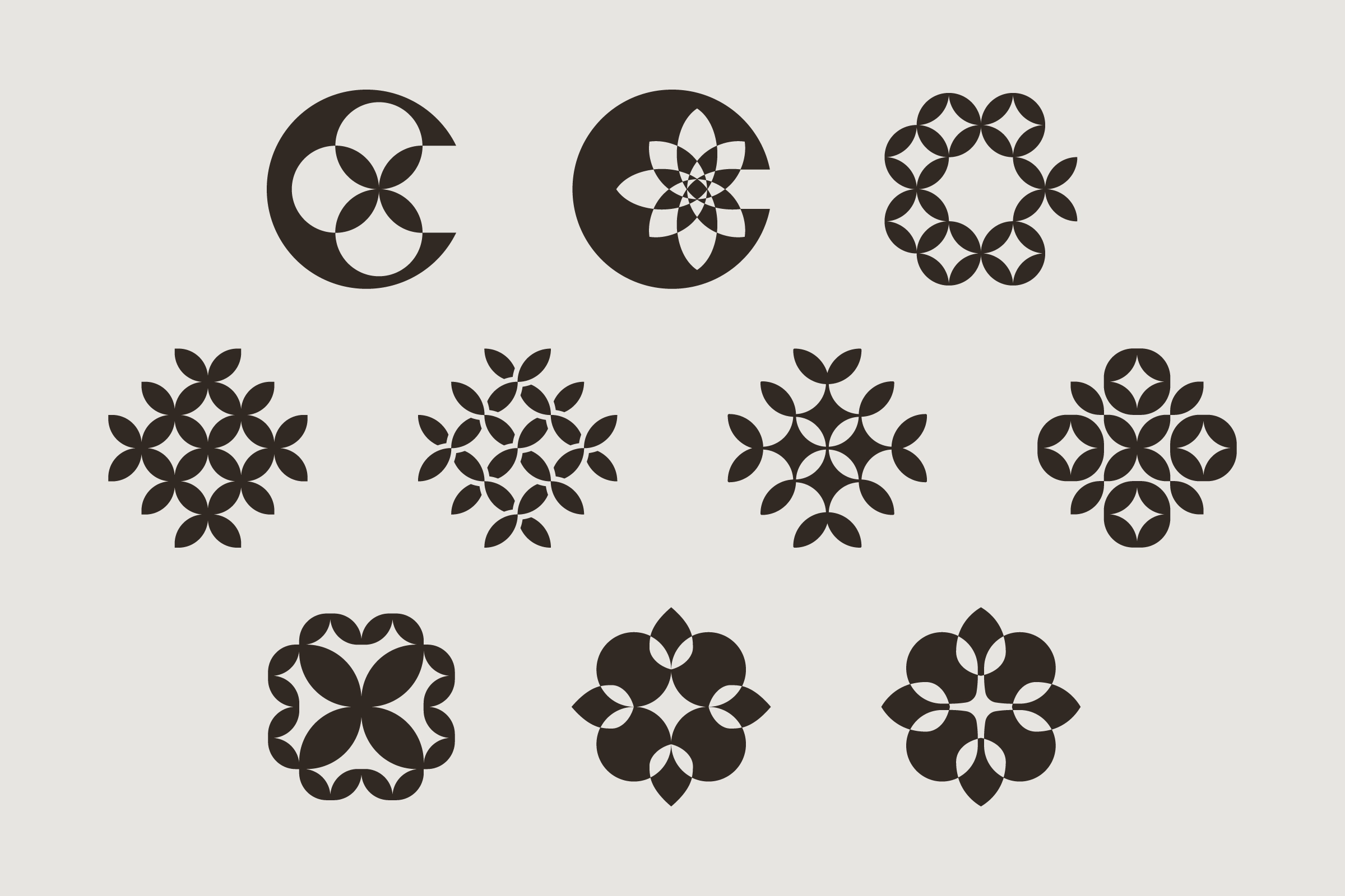
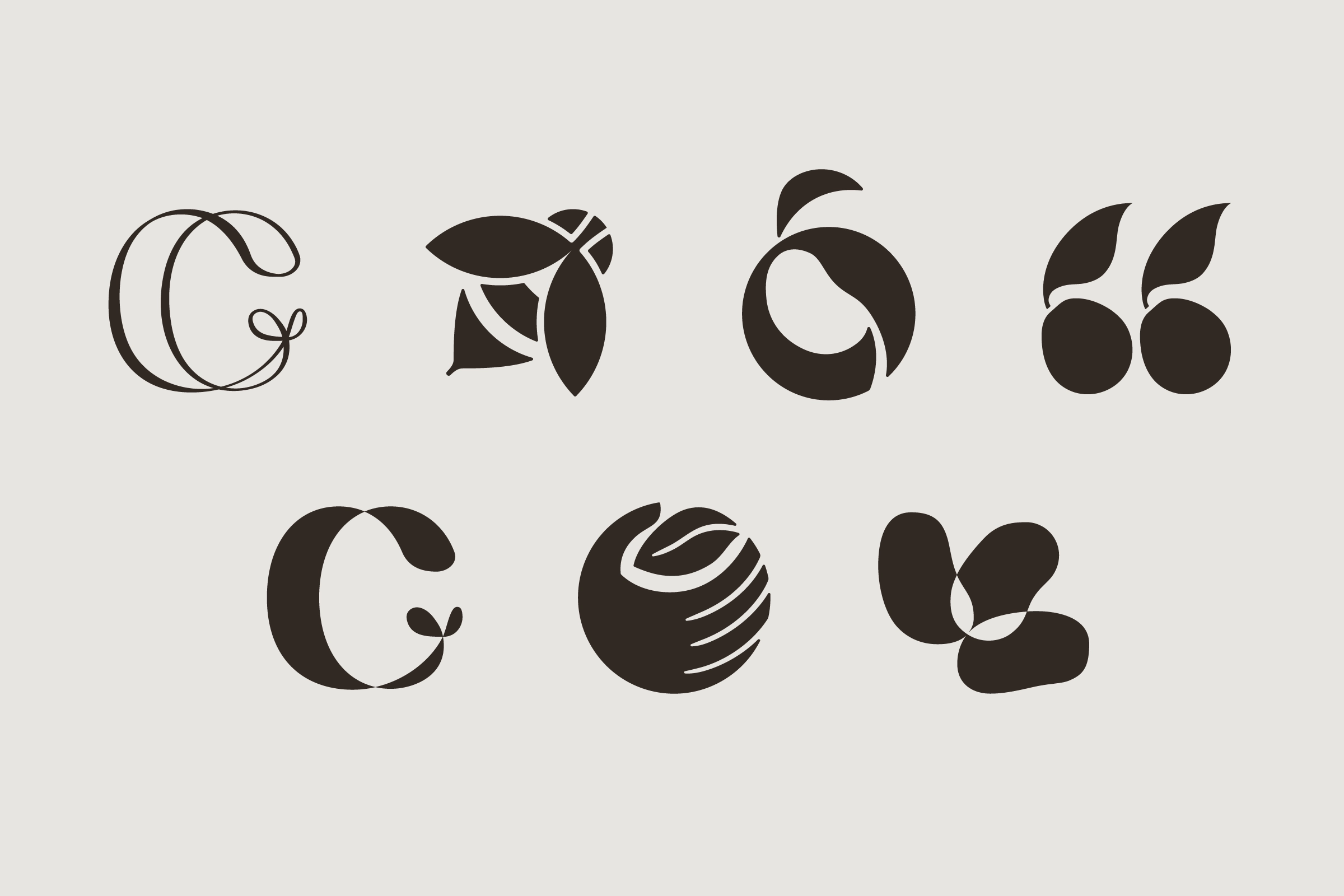
Cultivar: selective breeding in English, cultivating in Spanish — a word whose dual meaning mirrors the founder’s own dual cultural heritage, and the brand’s focus on intentionally nurturing community — visualized in a logomark of repeated leaf shapes, a farm spreading outward, flourishing the community. With the symbol, the identity is tied to the founder’s personality, shaped into a declaration of who she is and what she is here to do.

Understanding the Client & Project
Cultivar Communications, founded by Anya Hanna, a professional with corporate experience, helps small businesses and nonprofits in the food and agriculture sectors. The firm provides high‐quality communication tools typically reserved for large brands.
The goal of the project was to create a visual identity that reflects their vision and mission. This will shape the brand's initial impression and influence how the community views it.
Visualizing the Name
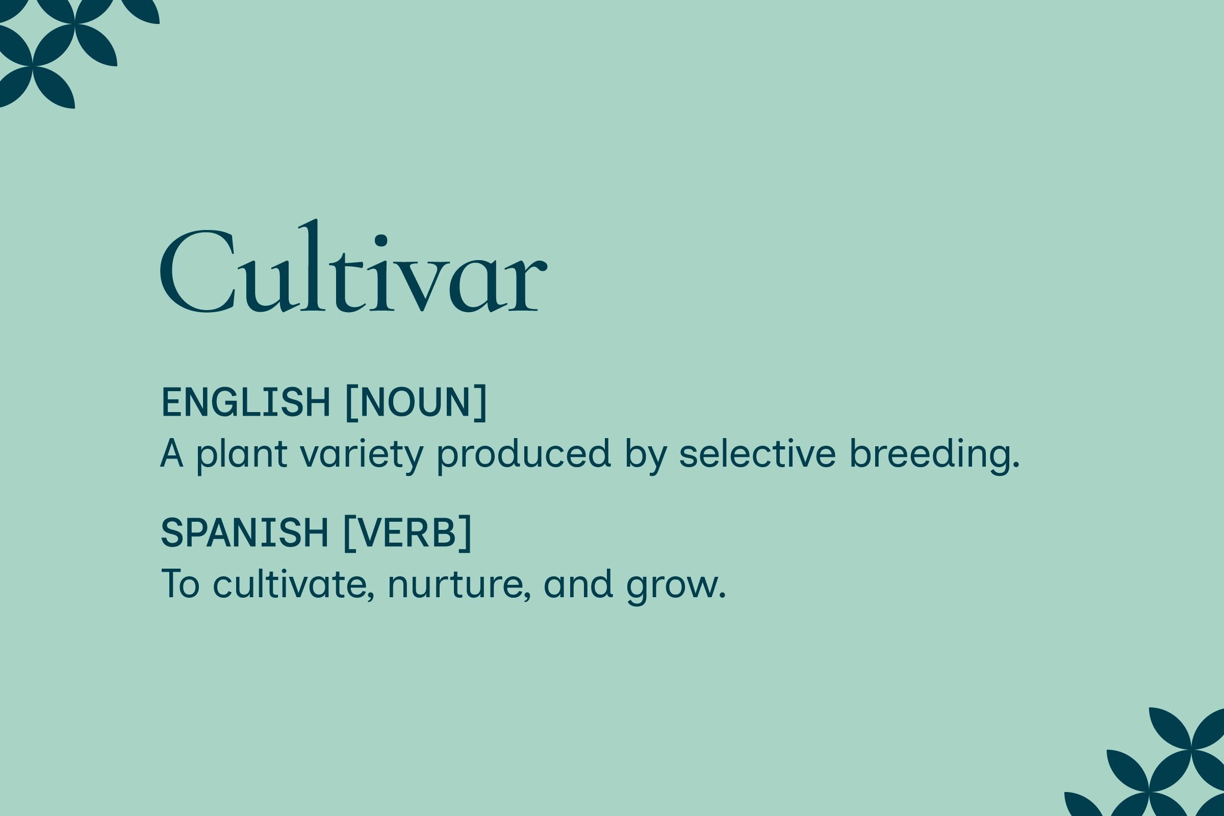
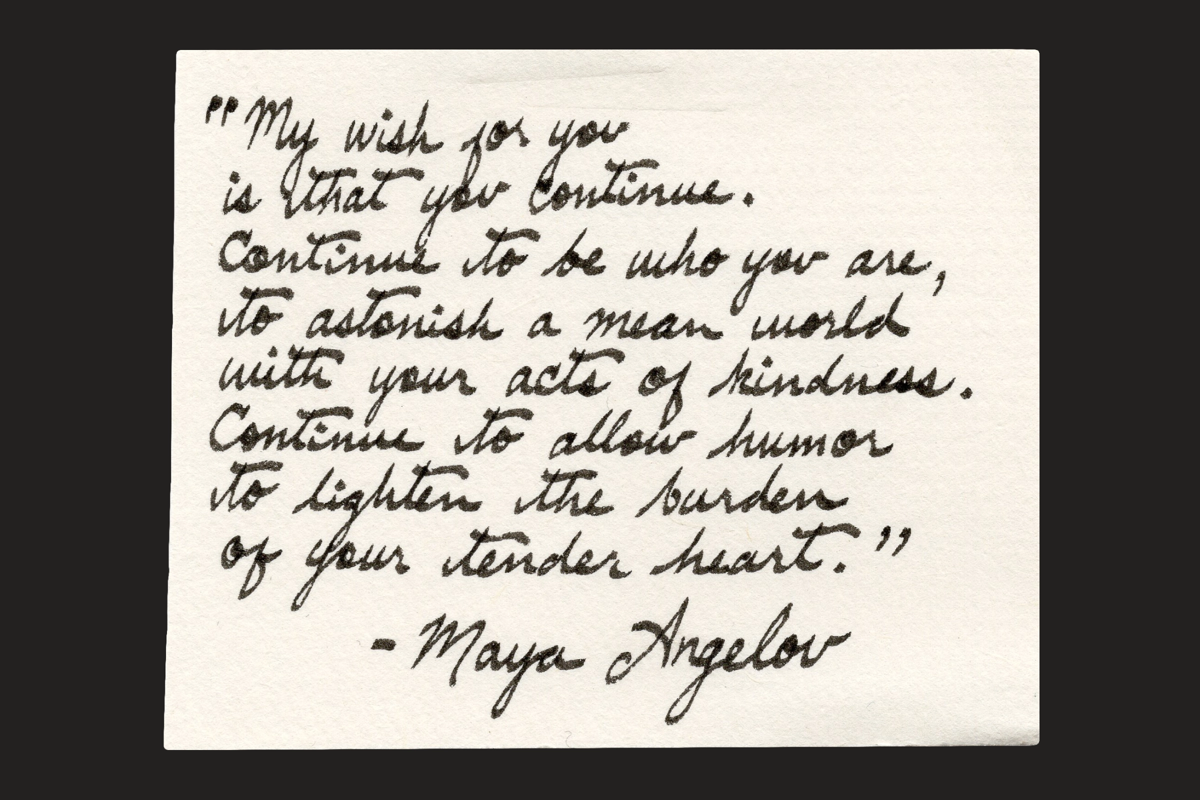
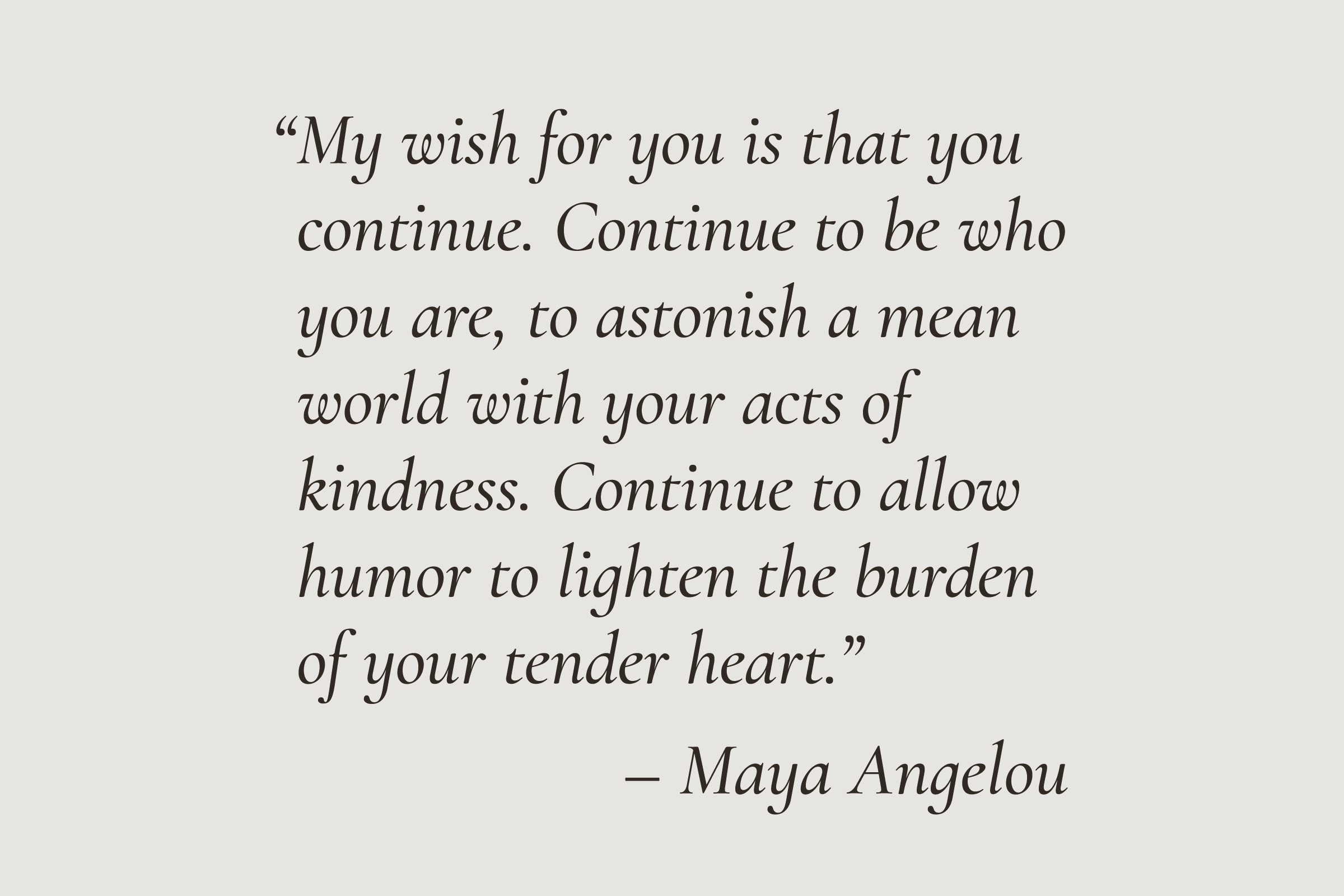
The founder named the company Cultivar Communication to emphasize her intentions and cultural roots: “cultivar” denotes selective breeding in English and cultivating in Spanish. This reflects the brand’s focus on intentionally nurturing both the brand and community. The project visualized the meaning of “Cultivar” within this brand and the vision: “Growing connection. Reaping results.”
Exploring Two Conceptual Directions
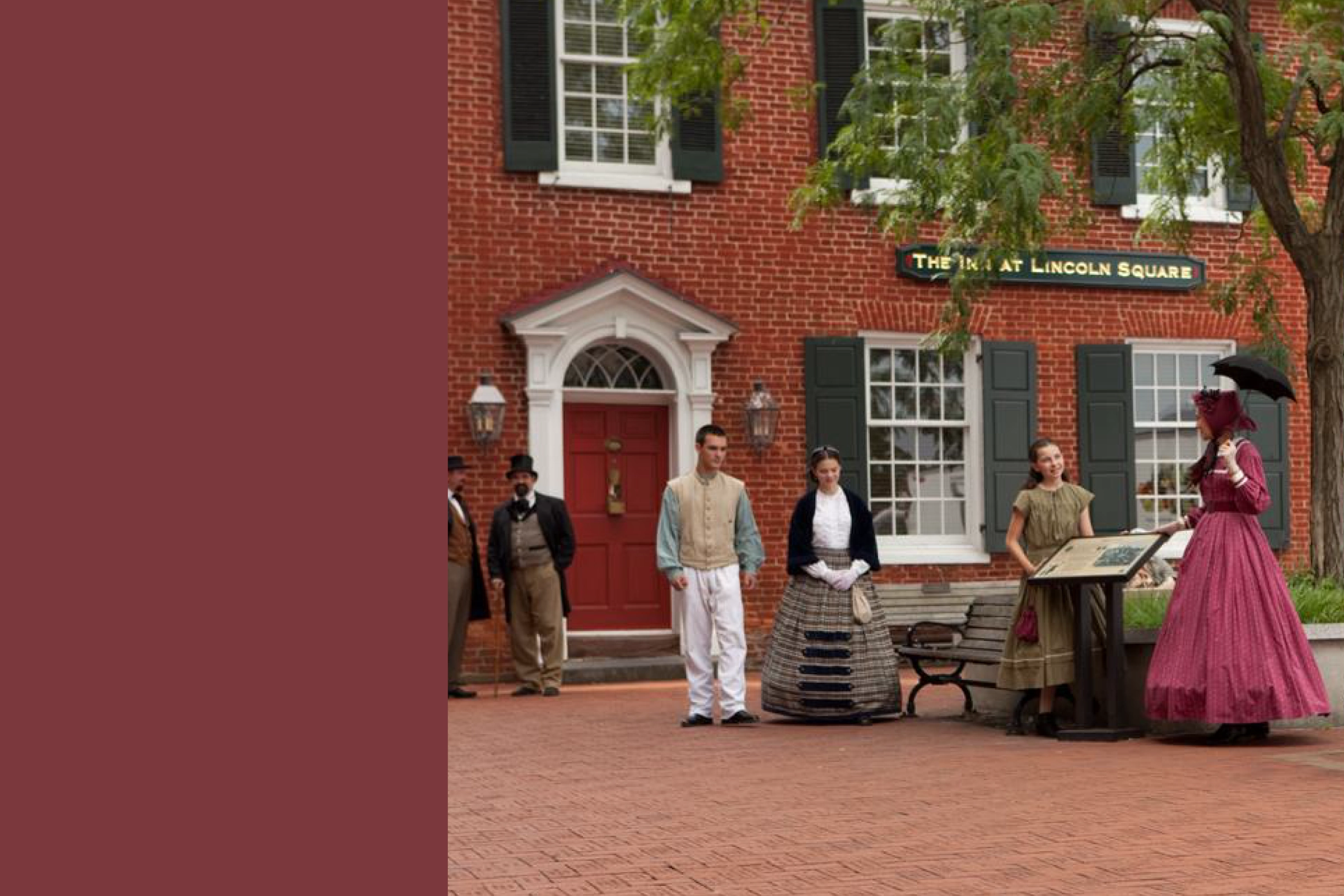
Idea 1. Grounded in Gettysburg Heritage
This idea was developed to reflect Gettysburg, the business’s birthplace. By utilizing location‐inspired visuals, the brand authentically connects with the community it serves.


Idea 2. Visualization of the Founder’s Essence (Selected)
This idea was developed to reflect the founder’s unique flavors and personality. By utilizing personalized brand visuals, the brand authentically connects with the audience it serves.

Expressing the Founder Through Color
Throughout her journey of discovering her loves in life, she realized that jewel tones represent her.
To ensure sustainable brand identity use, the palette has four color pairs to categorize clients as the business grows. Since main clients include small businesses, nonprofits, and purpose‐driven organizations, each group needs a tailored approach to express their authentic voice. These colors can be used strategically based on the founder’s approach as the brand evolves.

Balancing Human Expression & Professional Trust
The primary and secondary typefaces aim to communicate trust through a genuine human connection while maintaining a professional appearance. Cormorant Infant and Inclusive Sans were selected because their combination reflects the founder’s calligraphy talent and her distinctive style of writing glyphs.