Sangyup Kim
Philadelphia‐based Graphic Designer
- 2026 Pasa Conference, Conference Identity
- Cultivar Communications, Brand Identity
 Pasa Sustainable Agriculture, Brand Refresh
- Pasa Conferences, In‑house Visual Design
- Scars Uncovered, Brand Identity
- I’m Blue, Exhibition Identity
- African People & Wildlife, Iconography
Works
About
Pasa Sustainable Agriculture
Distinct Program Colors Within a Unified and Recognizable Brand
Service
Brand Refresh & In‐House Visual Design
Role
Design Specialist
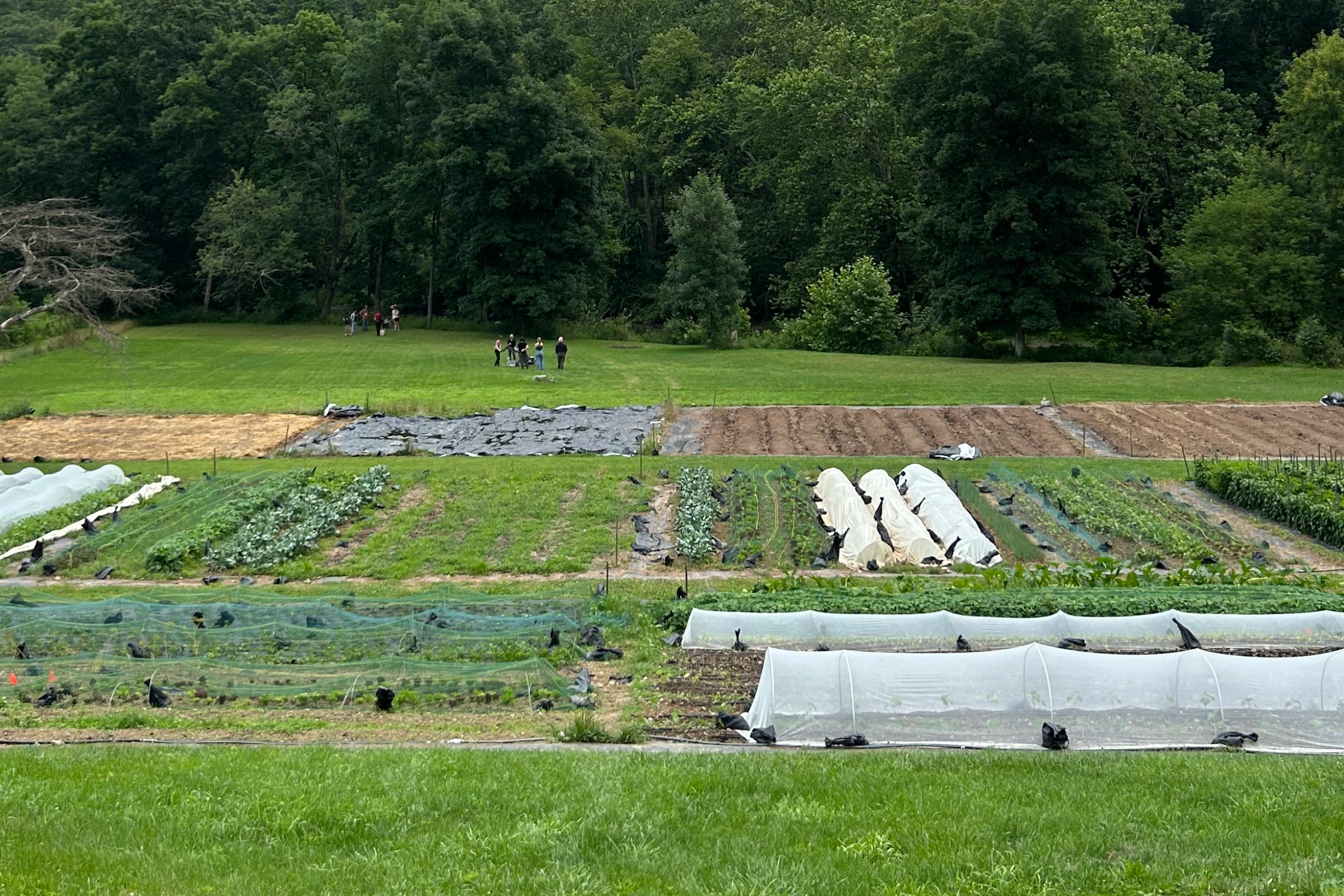
Five programs and a conference — each needing its own visual identity without pulling the brand apart. Six colors answer that need, each distinct, yet unified by a visual system rooted in patchwork. Inspired by satellite images of farm fields stitched together, patchwork carries a natural connection to sustainability and Pasa’s mission. The concept is visualized in a modern grid, with a primary color palette that keeps the brand future-focused, not nostalgic.

Understanding the Client & Project
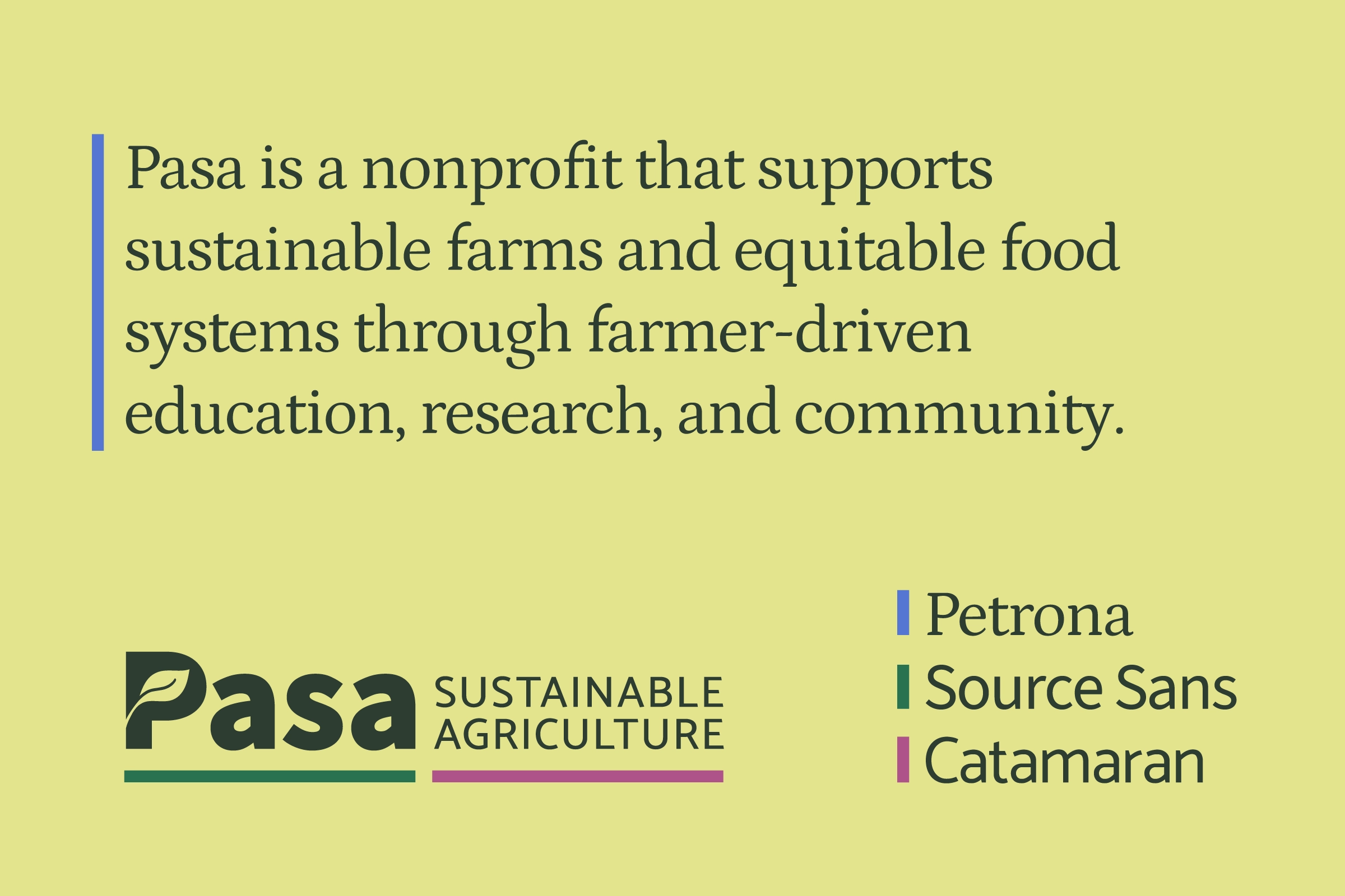
Pasa is a nonprofit that supports sustainable farms and equitable food systems through farmer-driven education, research, and community.
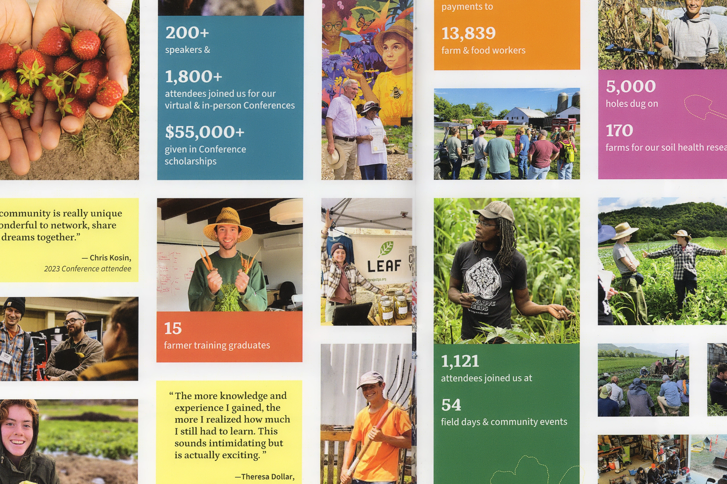
Through five programs and a conference, Pasa supports a wide range of sustainable agriculture initiatives. This brand refresh gives each program its own recognizable visual identity while maintaining a unified Pasa brand. It improves accessibility, readability, and web performance, and better aligns the visual system with the organization’s values and diverse farming practices.
Identifying Key Words for the Refresh Direction
Project meetings focused on identifying keywords and the values the refreshed brand should embody.
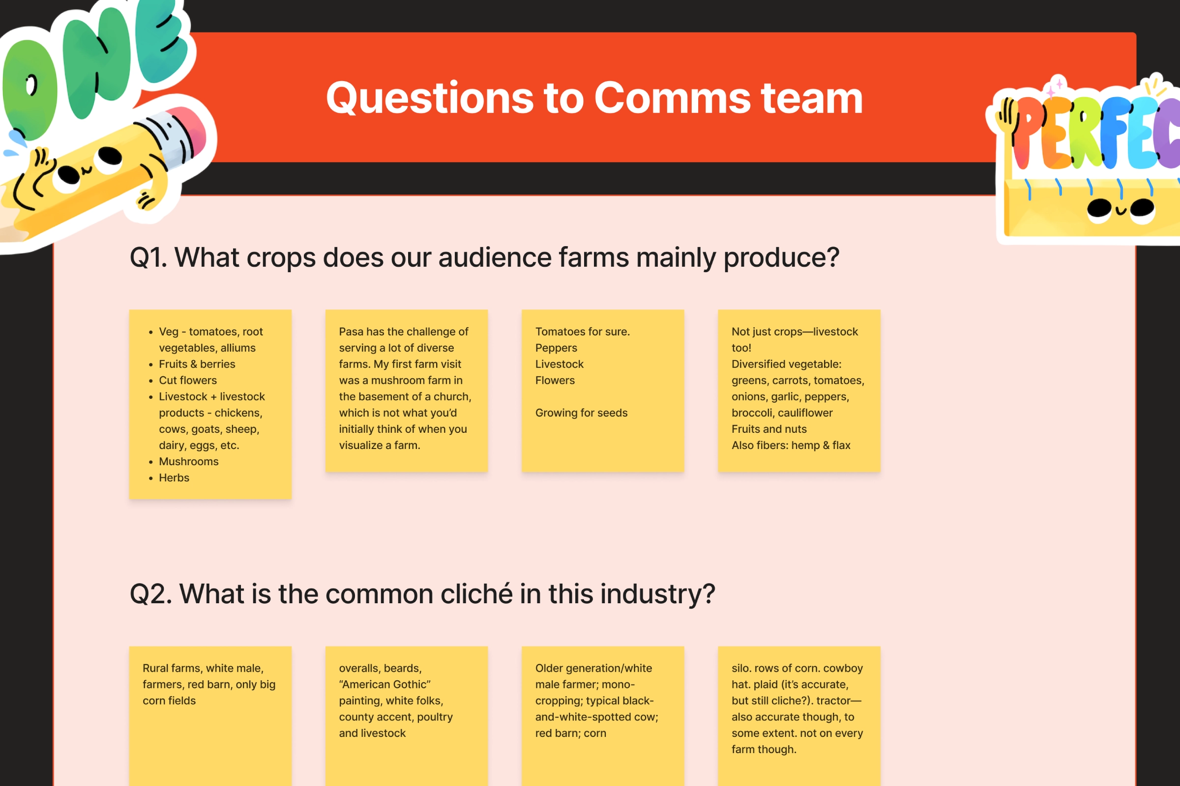
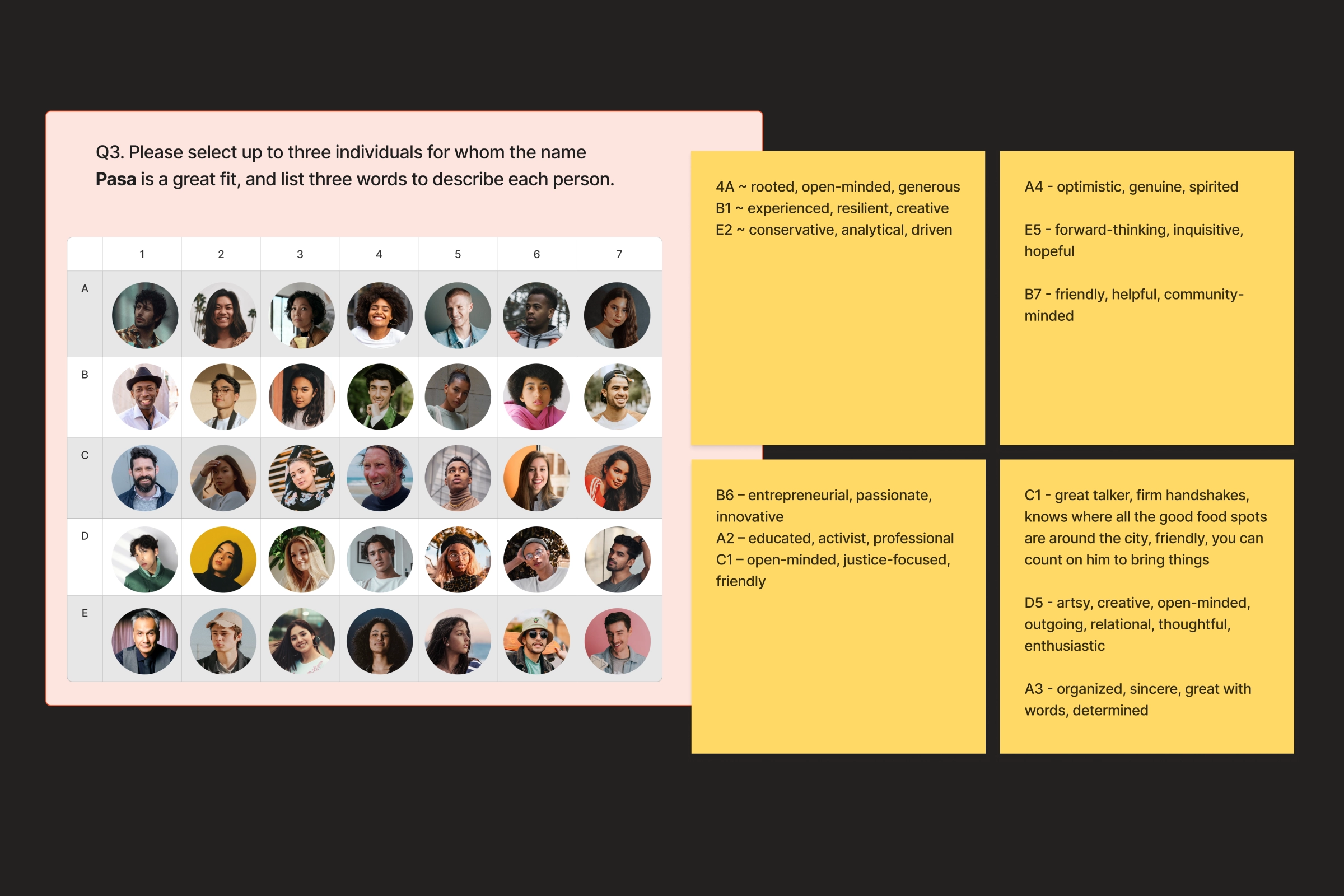
Translating Keywords Into a Concept Sentence
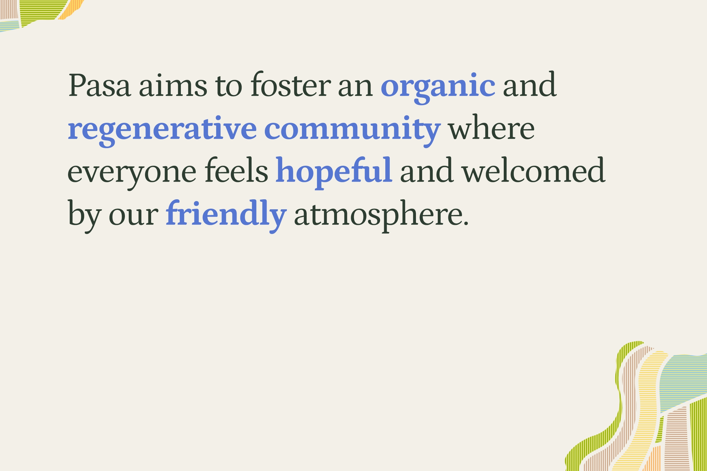
Recurring words and themes from the brand refresh meetings–led by me–were selected as core keywords: Community, Friendly, Hopeful, Organic, Regenerative. A sentence was constructed using these keywords to clarify the meaning and identify who Pasa is.
Clarifying Core Issues & Strengthening Brand Identity
Issue 1. The previous brand colors were inconsistent across digital and print media and did not meet accessibility standards.
Response
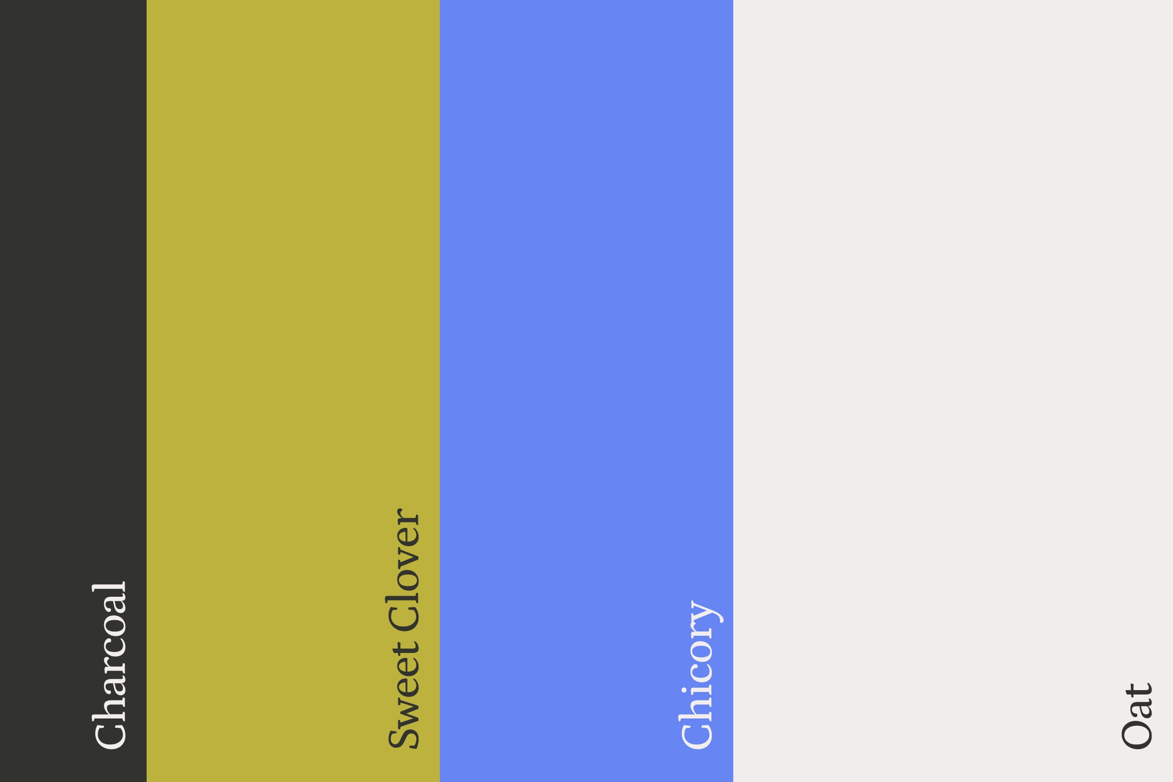
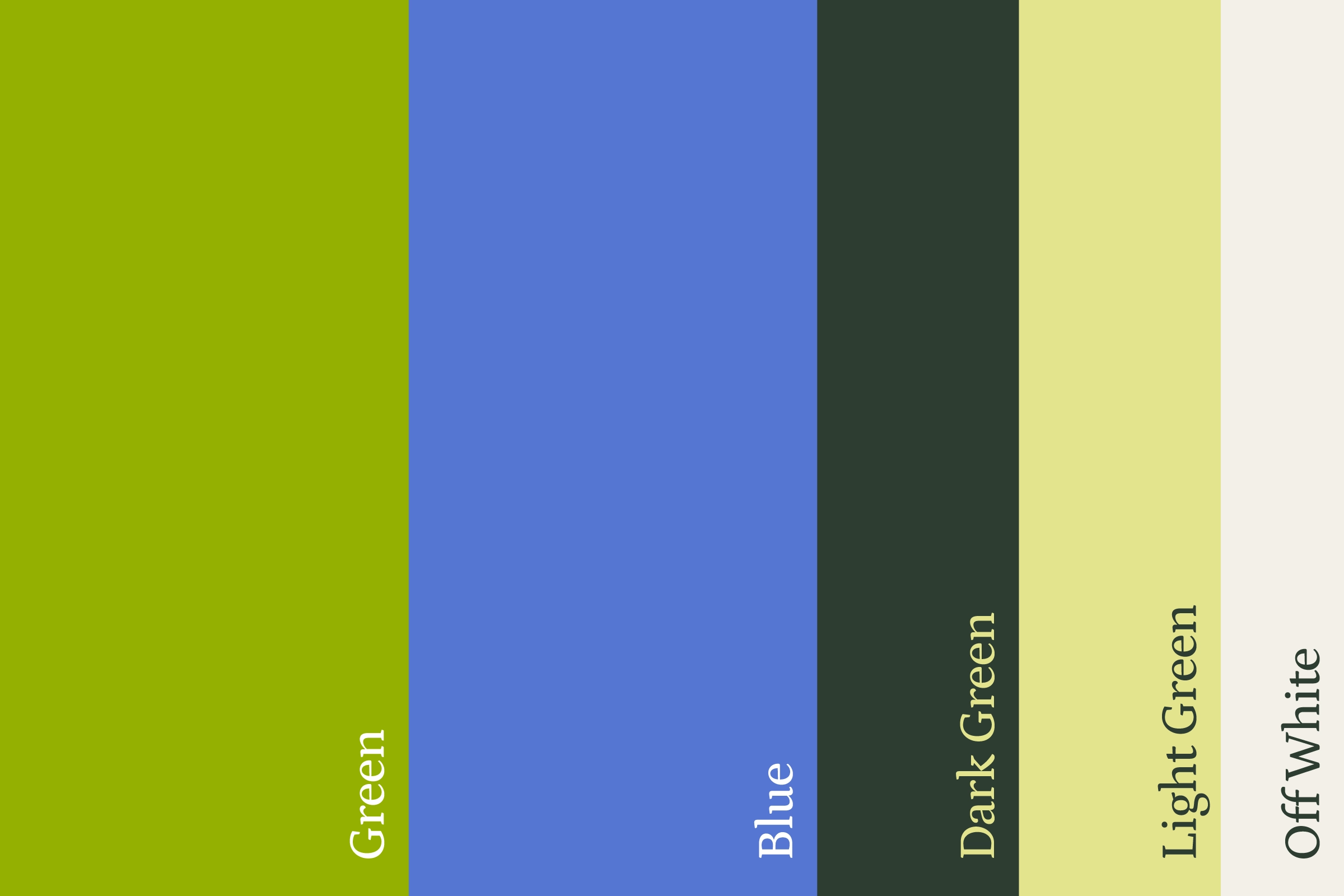
A new primary color palette was created using the Pantone Matching System, replacing previous colors with more saturated, accessible options that minimize the difference between print and digital. The palette includes light and dark greens to enhance contrast and improve usability across contexts.
Issue 2. The previous brand typefaces failed to effectively convey the brand’s personality and style.
Response
A serif typeface was introduced to the brand system to convey warmth, humanity, and a conversational tone that better reflects Pasa’s friendly, sincere voice.
Issue 3. Programs were not visually distinguishable, making them harder to identify and navigate.
Response
A secondary color palette was created with six colors, one for each program, paired with stamped‐style program labels to help viewers match the color to the program.
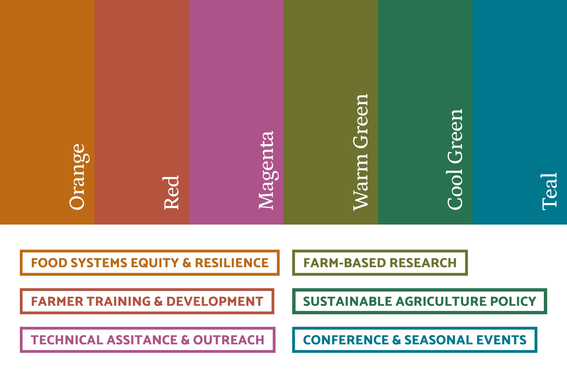
Issue 3+ (Resulting Need). The distinct program identities required a visual system to ensure consistent communication and alignment under the Pasa brand.
Response
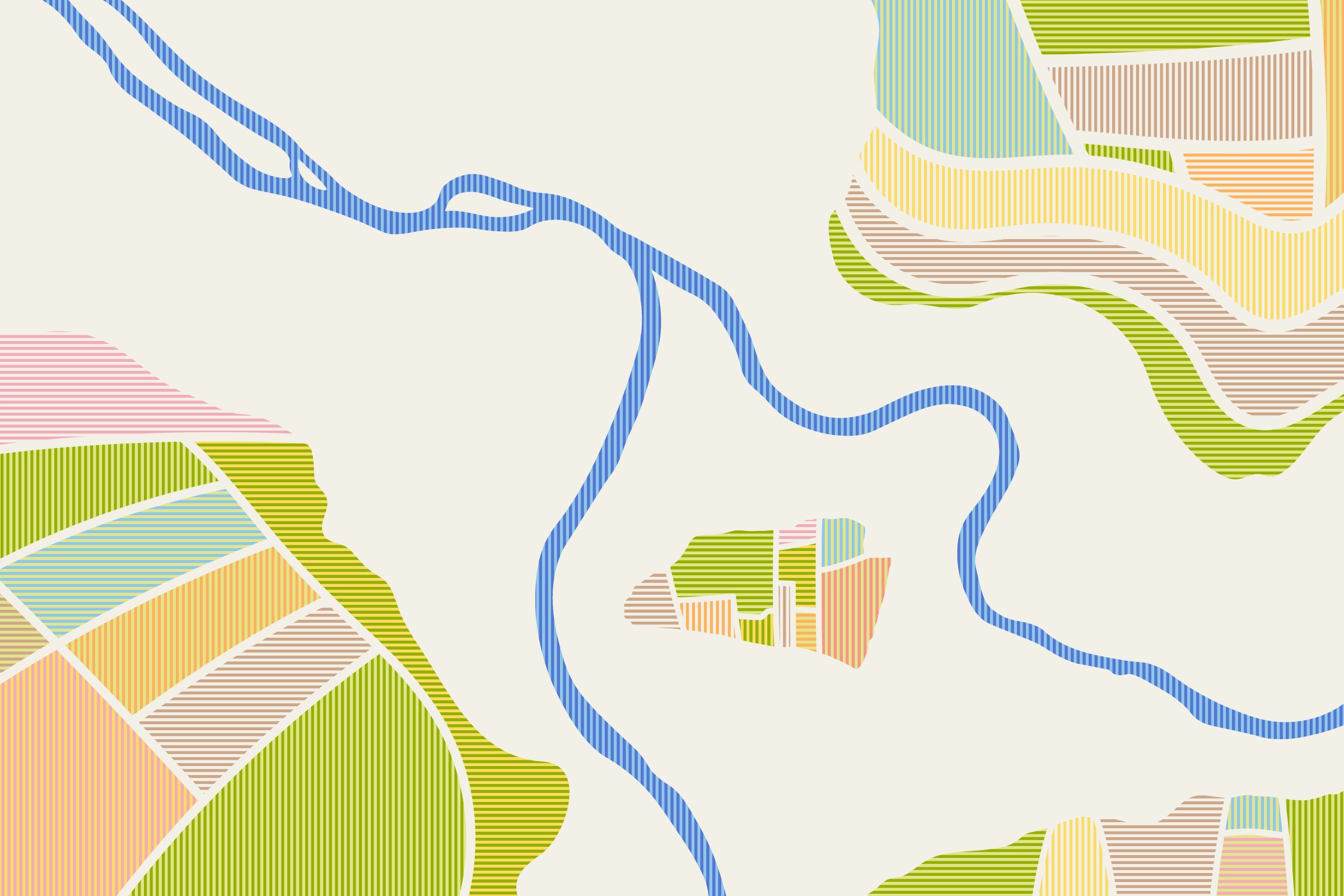
A visual system inspired by patchwork was created, drawing from satellite images of farm fields that look stitched together like a quilt—symbolizing connection and collective effort. Since patchwork also represents sustainability, it provides a meaningful visual theme that aligns well with Pasa’s mission.
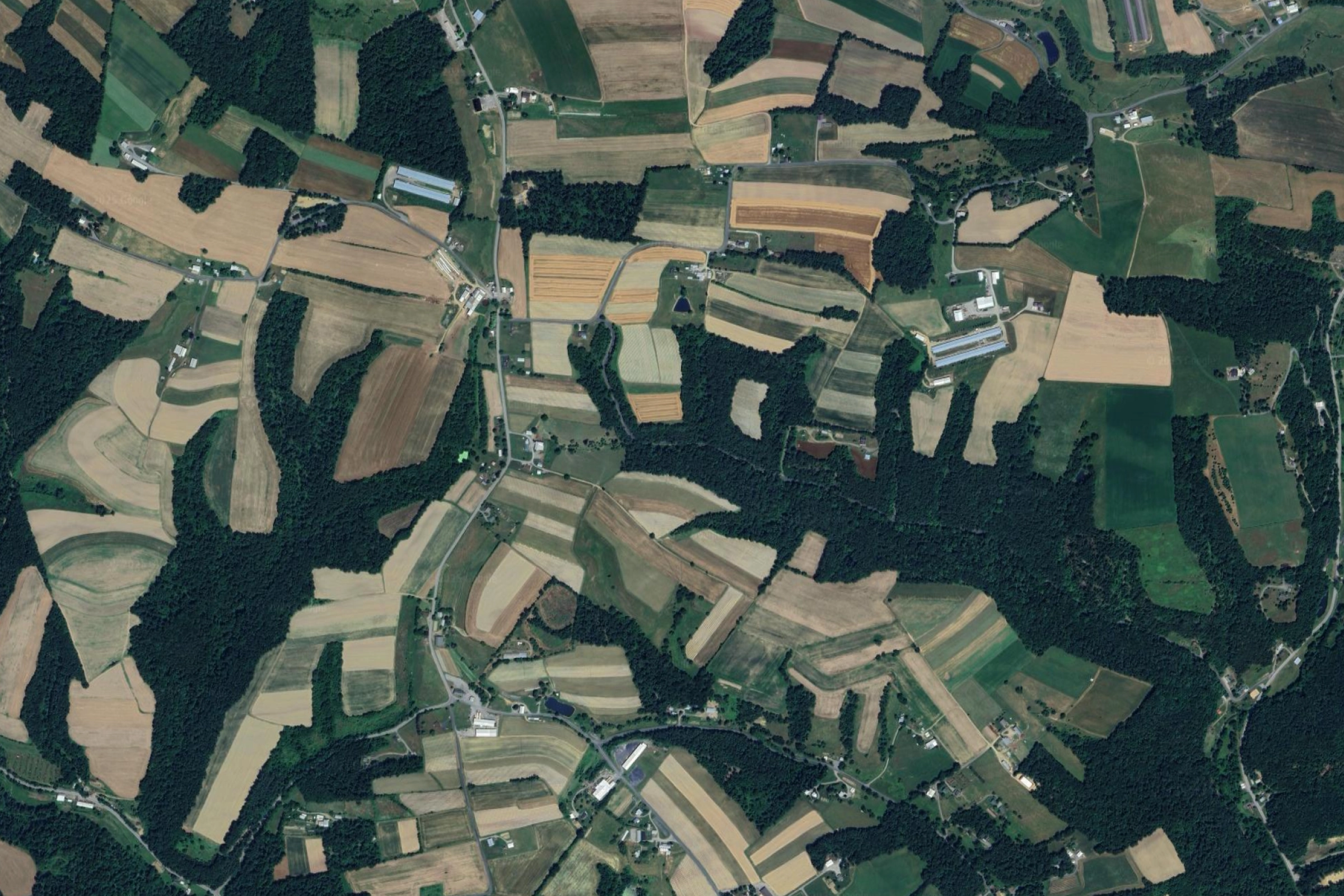
This visual system features a modern grid style to prevent a nostalgic or overly rustic feel, supporting a contemporary, future‐focused brand expression.
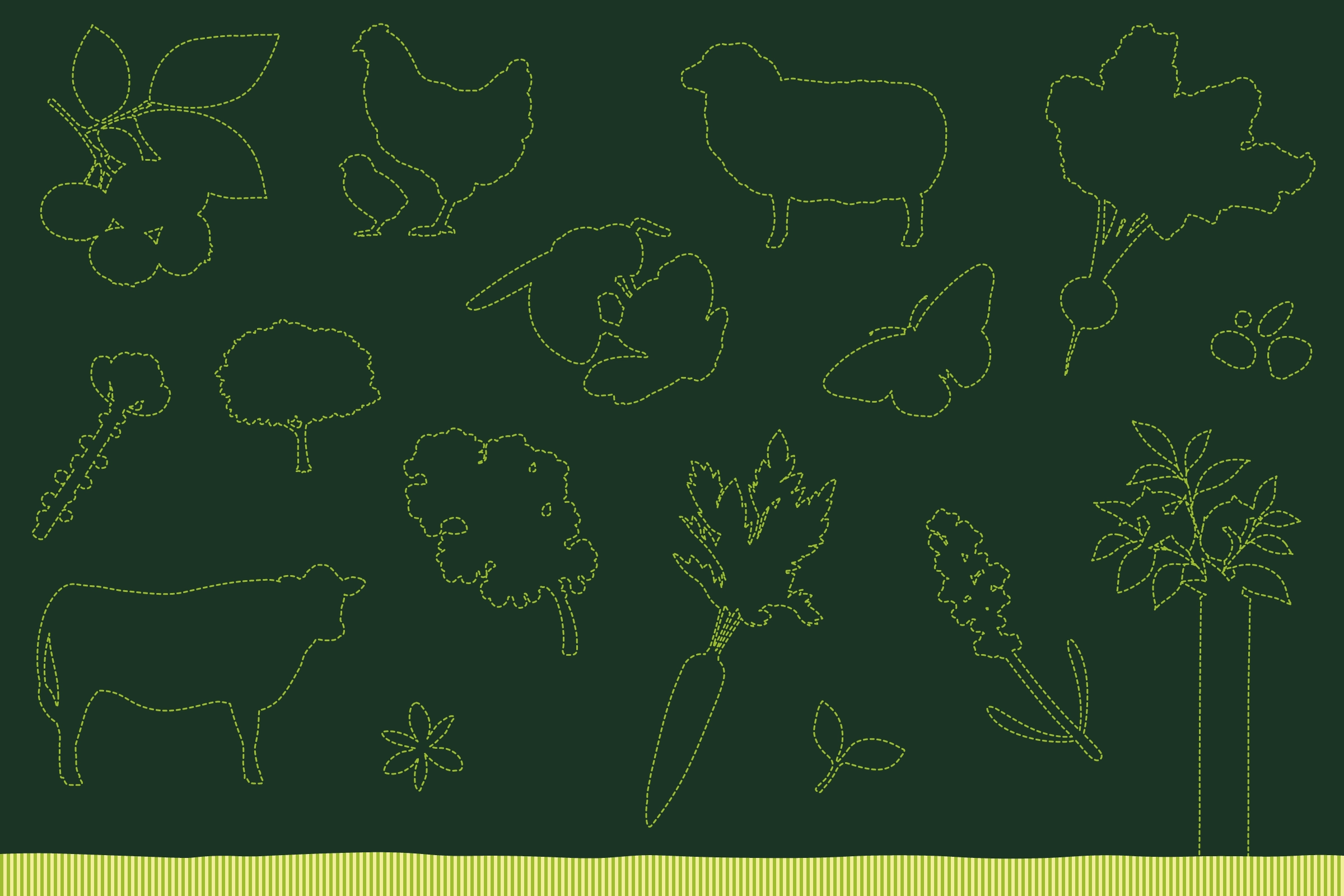
Additional accent graphics inspired by stitching and patchwork enhance recognition of the concept and bring energy and warmth to communications.