A refreshed brand, expanded for the conference 2026 Pasa Sustainable Agriculture Conference
Service
Conference Identity & Editorial Design
Role
Freelance Designer
Year
2026
For the 35th year of the Pasa Sustainable Agriculture Conference, I built the identity from what was already there. I worked within real constraints, guided by two key words: inclusive and community. I went deeper into Pasa’s existing brand, so the identity felt grown from the inside rather than applied from the outside.


Understanding
Understanding the Client & Project
Pasa’s annual conference brings together farmers, educators, advocates, researchers, policymakers, and community members for three days of learning on sustainable agriculture and food systems. Each year, Pasa collaborates with a different artist to build a distinct visual identity for the conference.
For 2026, I joined as a freelance designer, after my in‑house role at Pasa. I built the conference identity: its pattern sets, its accent graphics, and the guidelines for using them. I also designed editorial pieces, such as the trade show guide and the program book.

Insight
A Constraint Turned Opportunity
For the 2026 conference, Pasa’s 35th year, a sudden federal grant freeze left limited time and budget, calling for a different approach. Rather than starting from scratch, I built on Pasa’s recently refreshed brand, which I had led as the in‑house design specialist. That turned the constraint into an opportunity: introducing the organization’s visual system to a wider conference audience. The conference identity became a fuller expression of that brand. Its graphic elements will carry on after the conference, helping the refreshed brand show what Pasa stands for today.
Identifying Key Words for the Visual Direction
Two key words shaped the design decisions for this project: Inclusive and Community.
Translation
Up close, each attendee sees where they belong. Pulled back, they see the community they build together.
Translating Key Words Into Visual Language
Inclusive
The expanded accent graphic set represents the range of backgrounds present at the conference. New graphics of farm products, agricultural research tools, and farming equipment help attendees from different contexts see themselves in the visual system.


Community
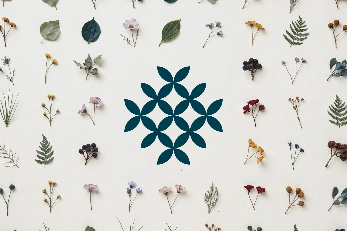
Pasa’s primary and tertiary colors are woven through the background pattern sets. Each pattern feels connected to the brand, while adding depth and variety to the system.


For accent graphics, primary, secondary, and tertiary colors are interwoven, adding richness and visual emphasis. Secondary colors represent each of Pasa’s individual programs, while the patterns as a whole visualize how a community is organized, distinct parts forming a coherent whole.


Sewing lines and edge stitches serve as supporting graphic elements, adding variety and energy within the system. They highlight key information across deliverables while reinforcing the patchwork concept that anchors Pasa’s brand.


Controlling Visual Weight Through Accent Graphic Sets
Two accent graphic sets, pattern fill and dash‑lined, range from heaviest to lightest visual weight. Mixing these sets limits how much pattern appears in any single view, while maintaining the patchwork and collage feel that ties each piece back to Pasa’s brand.