A look drawn from the artwork itself I’m Blue
Service
Exhibition Identity
Role
Freelance Designer
Year
2021
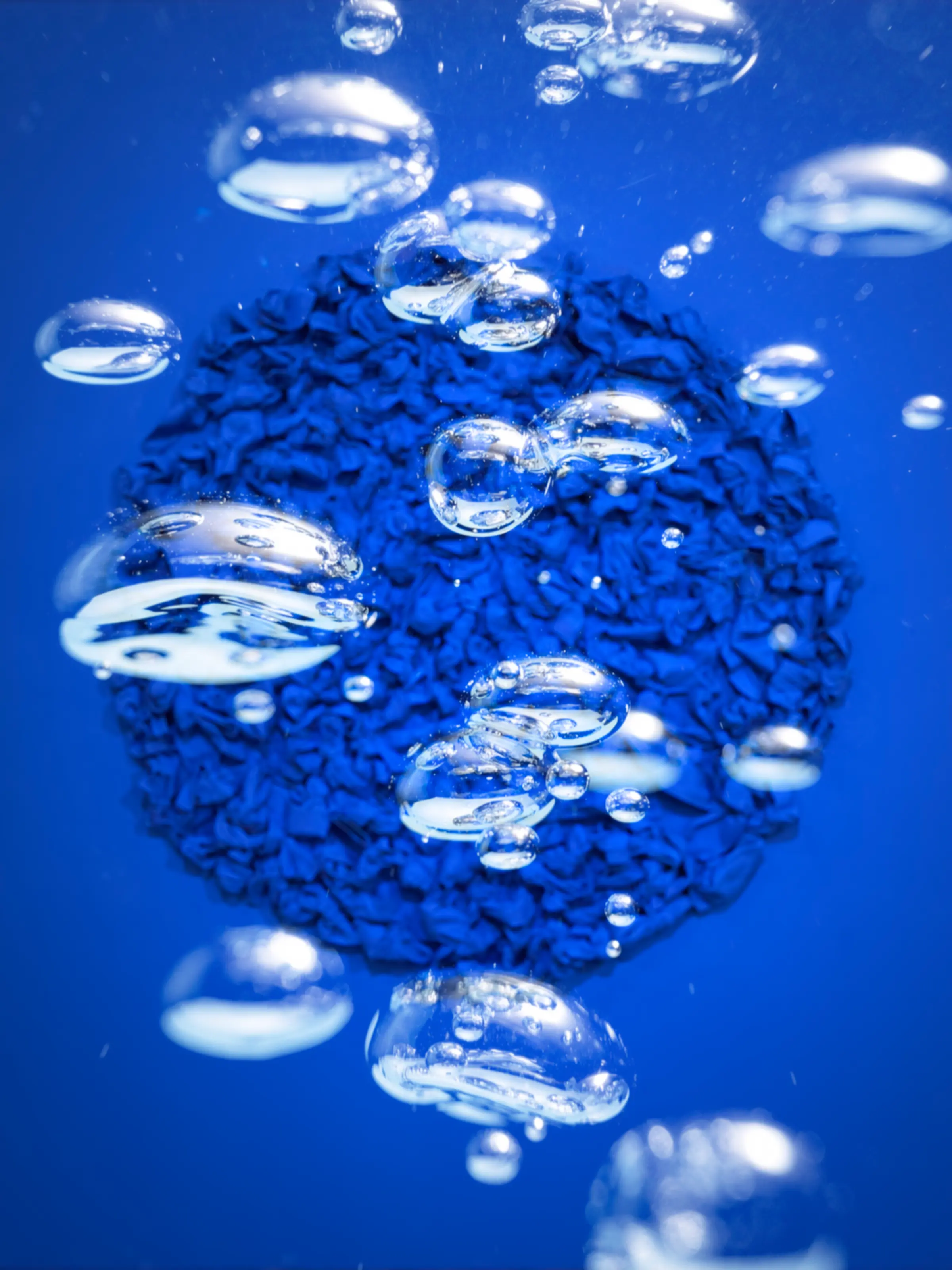
Blue as melancholy, blue as the ocean, Luke Han’s exhibition sought to comfort people in hardship by reframing the feeling through the energy of the color itself. Bubbles rising through water became the visual thread, drawn from the circular form of the main artwork. Their upward motion, ascending scale, and generous spacing carry the same quiet energy as the work.


Understanding
Understanding the Client & Project
Through I’m Blue, Luke Han spoke to people facing hardship during the pandemic. The work reframes feeling “blue” through the positive energy of the color blue.
Insight
Finding Visual Metaphors in the Artwork
I studied the main artwork and found two key qualities: a sense of Oneness in its circular form, and a calm atmosphere. These qualities recall the imagery of bubbles rising in the ocean, which became a central metaphor for the exhibition. The bubble represents quiet movement, resilience, and gentle energy, connecting the artwork to the exhibition’s thesis.


Translation
Animating the Energy of Blue
Animated bubbles, combined with the main artwork, carry this metaphor. The slow upward motion communicates natural energy while maintaining a calm and peaceful tone.
Applying the Concept Across Print Media
On print materials, the concept lives in the layout rhythm. Elements grow larger from bottom to top, resembling ascending bubbles, while their alternating left and right positions suggest a natural flow. Generous spacing gives typography and images room to breathe, establishing a calm, steady visual rhythm.