Sangyup Kim
Philadelphia‐based Graphic Designer
- 2026 Pasa Conference, Conference Identity
- Cultivar Communications, Brand Identity
- Pasa Sustainable Agriculture, Brand Refresh
- Pasa Conferences, In‑house Visual Design
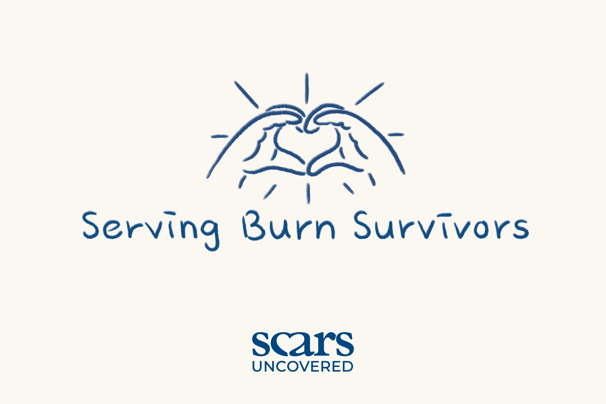
 Scars Uncovered, Brand Identity
- I’m Blue, Exhibition Identity
- African People & Wildlife, Iconography
Works
About
Scars Uncovered
A Caring Brand Identity Rooted in Warmth and Support
Service
Brand Identity
Role
Freelance Graphic Designer
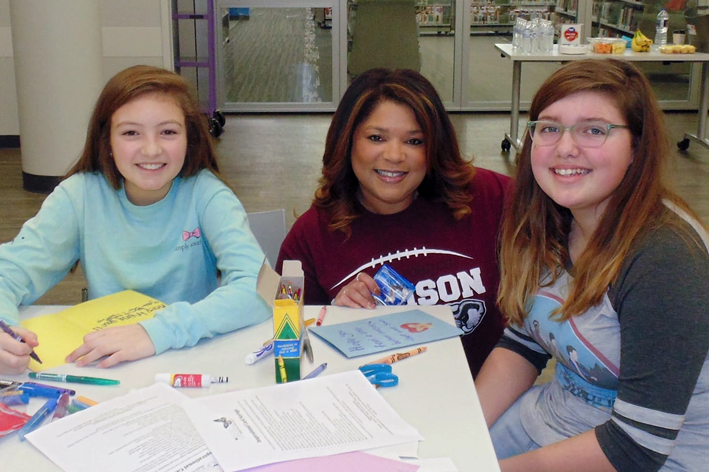
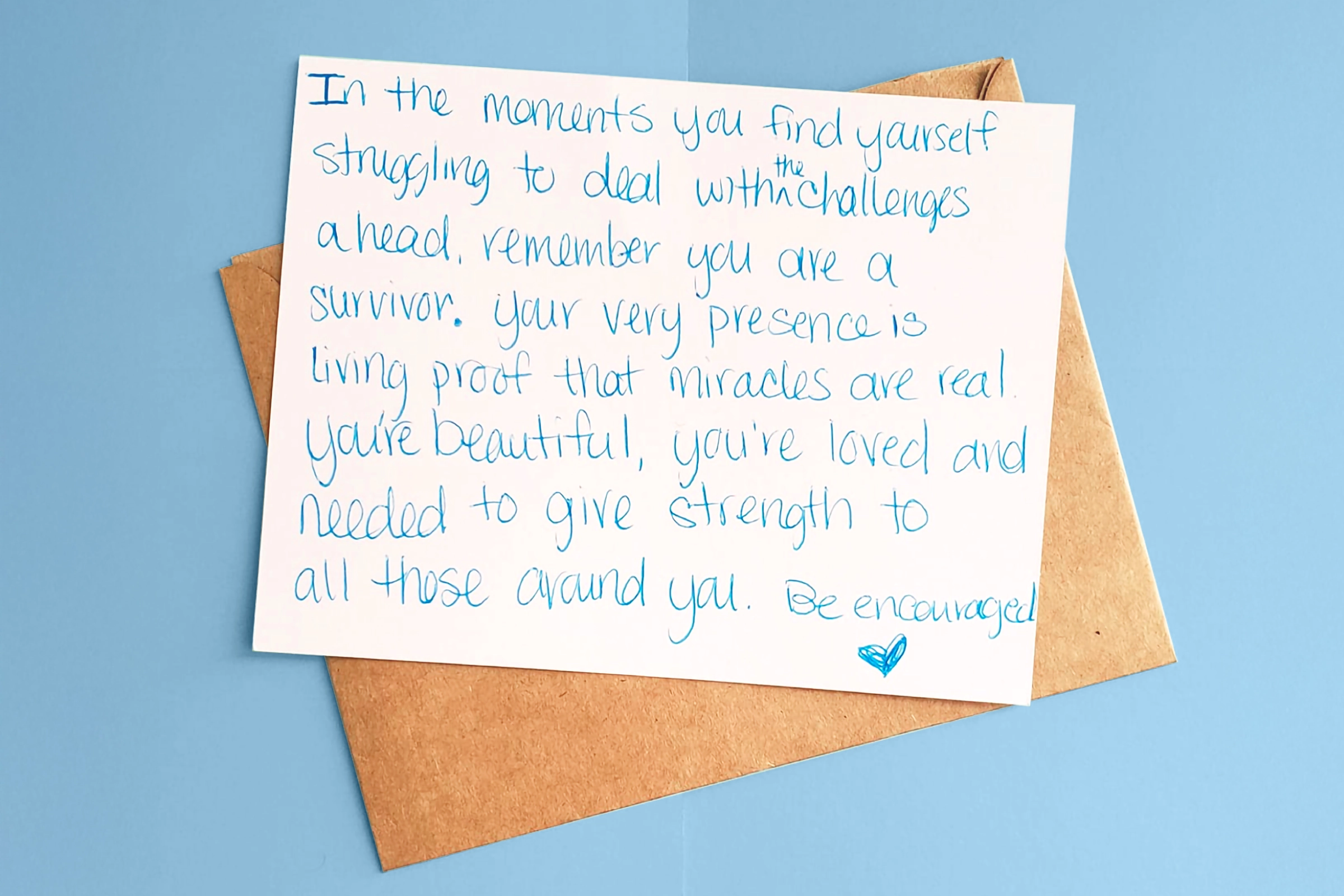
Burn survivors receiving a Box of Love at their most vulnerable moment — Scars Uncovered needed an identity as warm and human as that gesture. Three keywords drawn from research and founder discussions, and one found photograph of students writing encouraging letters, guided the work: a heart embedded in the letterforms, handwritten details, and hand-drawn doodles that carry the same sincerity as the volunteers behind them.

Understanding the Client & Project
Scars Uncovered is a nonprofit that supports burn survivors and their families through Boxes of Love, a program that partners with burn units to deliver care packages during the recovery process. These packages provide comfort, encouragement, and a sense of connection at a critical time.
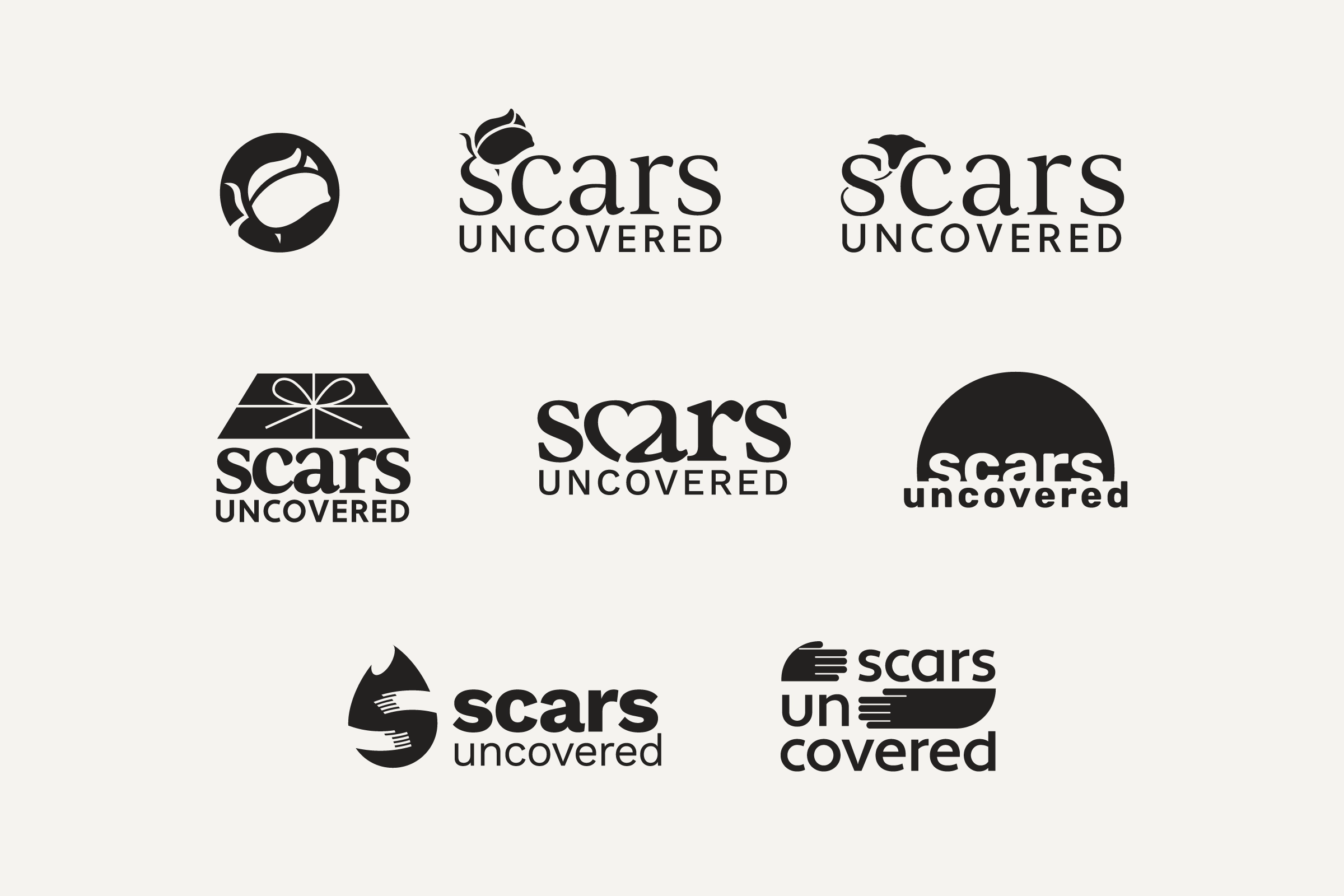
The project focused on two primary goals. The first was to craft a meaningful and memorable experience for survivors and their families that embodies the organization's message of warmth, care, and hope. The second was to replace a complex, textured illustration with a new visual concept that ensures high recognizability and scalability across all media platforms, while preserving the brand's core message.
Defining Key Brand Qualities
Through research and discussions with the founder, three core keywords were identified to guide the brand: Encouragement, Love, and Approachability. These values serve to humanize the brand while reinforcing the warmth and care that Scars Uncovered provides to the communities it serves.
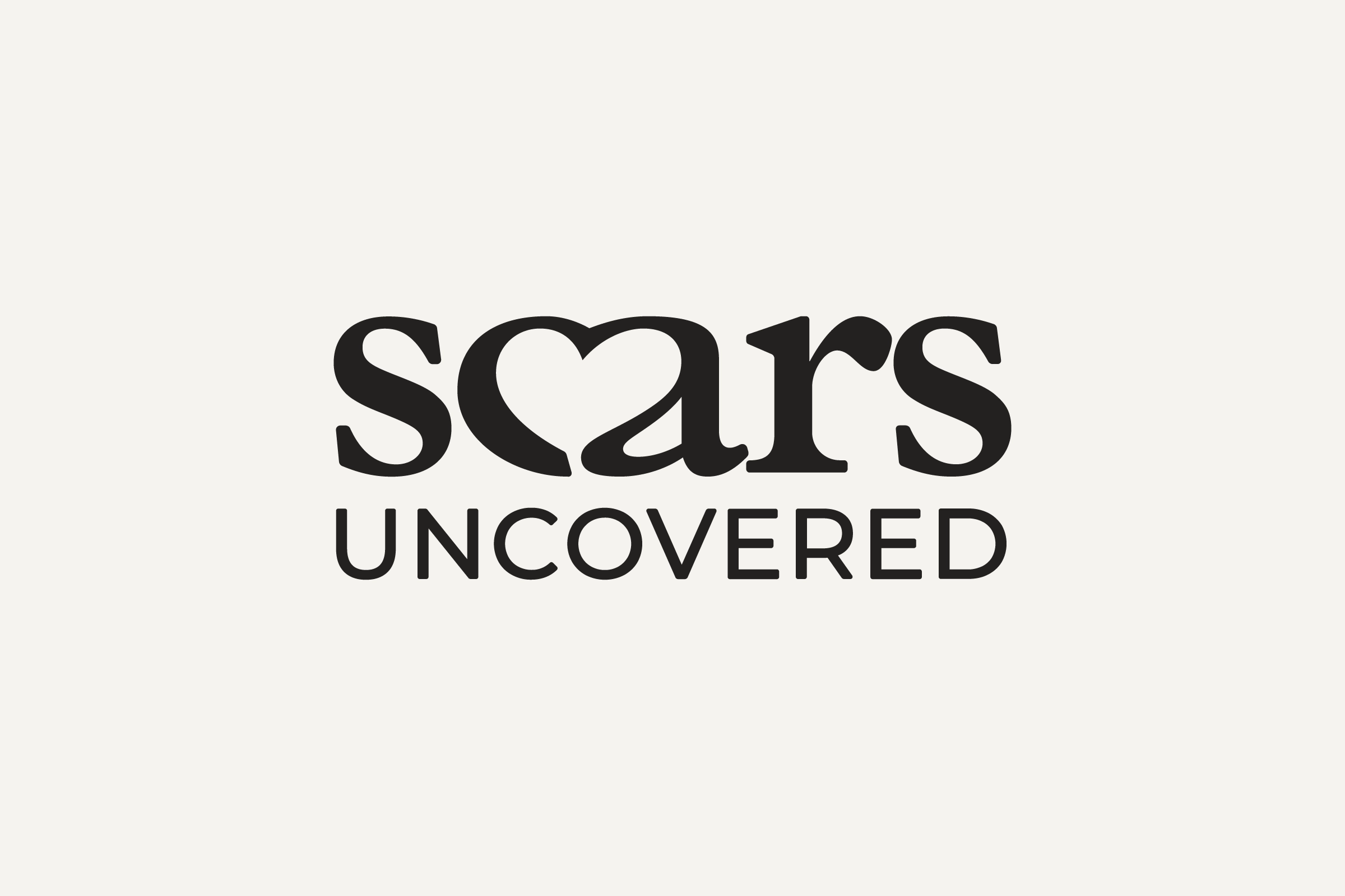
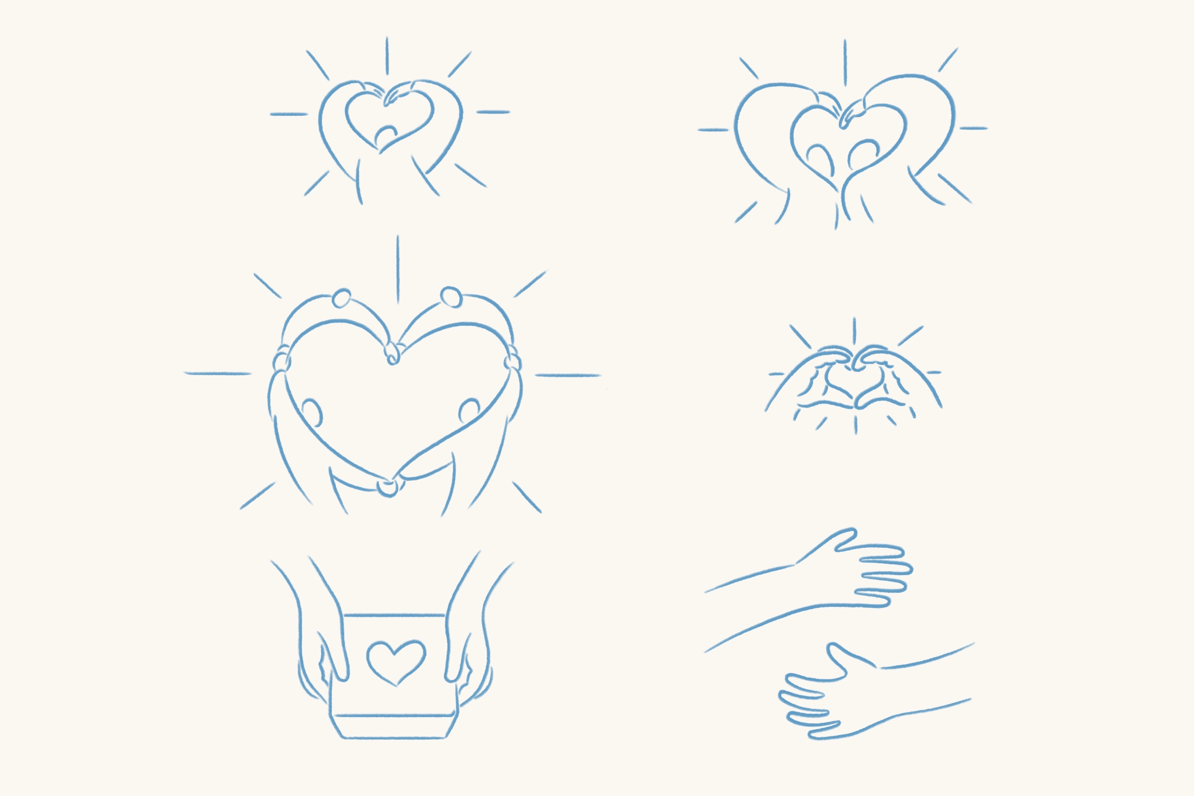
Combining the Keywords With the Name
A heart shape was embedded within the name as a clear, recognizable symbol that embodies the brand’s keywords. The letters “C” and “A” were combined with the heart to visually communicate encouragement, love, and approachability.
Finding Inspiration for Humanization of the Brand
The organization’s photo archive provided inspiration for the visual direction. One image stood out: two young students writing encouraging messages for burn survivors. The sincerity and energy in this moment became the foundation of the brand identity.
This moment reflects how volunteers dedicate time and care to supporting survivors, suggesting that a handwritten style would effectively convey the warmth and authenticity of their intentions.
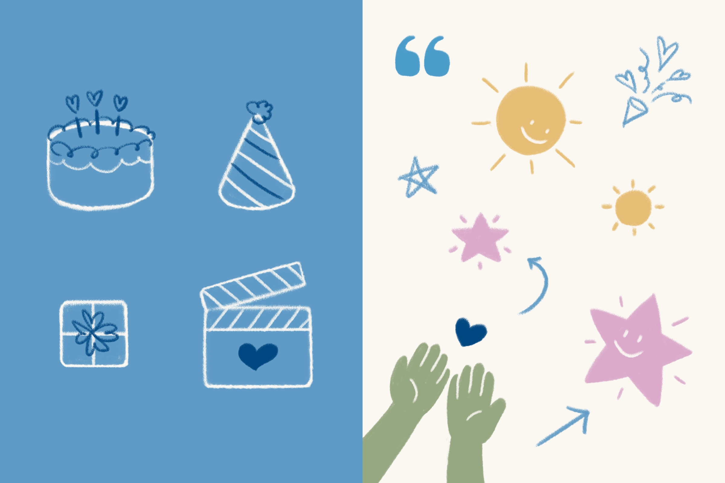
Translating Emotion Into Design
Brand elements were designed to capture the essence of this inspiration. A handwritten‐style tagline, along with hand‐drawn doodles and icons, was developed to convey the organization’s heartfelt encouragement and approachability.
These visual touches communicate the compassion, energy, and love that define Scars Uncovered, creating a visual identity that resonates with both survivors and their families.
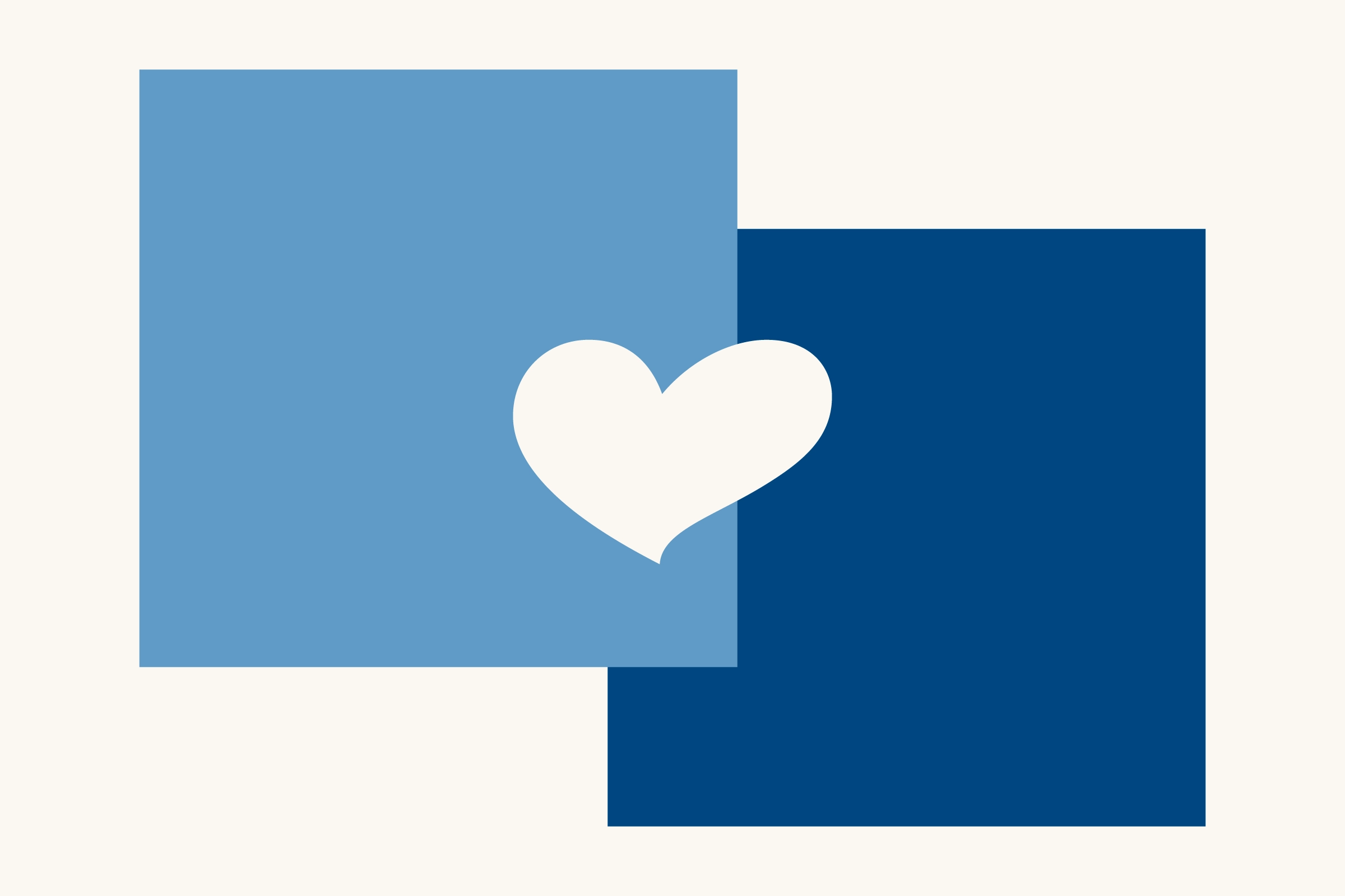
Selecting a Color Palette
A low‐saturated light blue was chosen as the primary color. Its cool yet soft tone conveys warmth and calm, which aligns with the values typically expressed in this brand’s communication. To provide sufficient contrast and readability across media, a darker, more saturated blue was selected as the secondary color.