Typography
“Sy Roman”
“Sangserif”
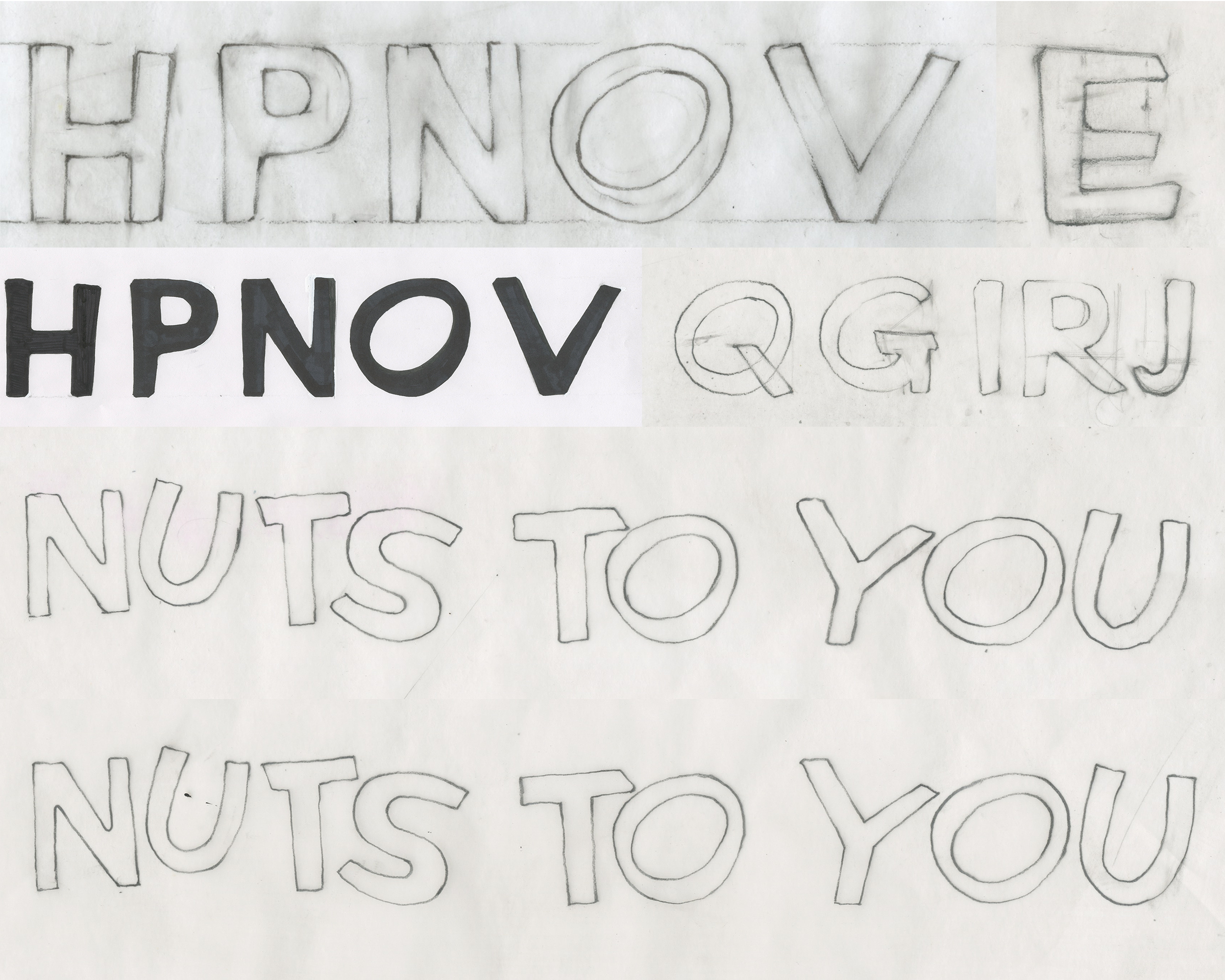
“Yup’s Marker”
1. Sy Roman
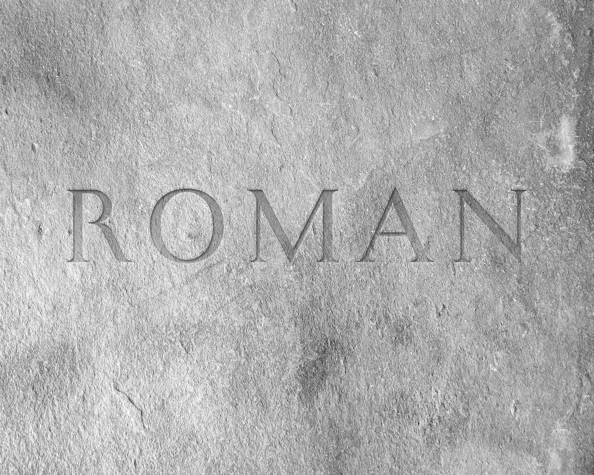
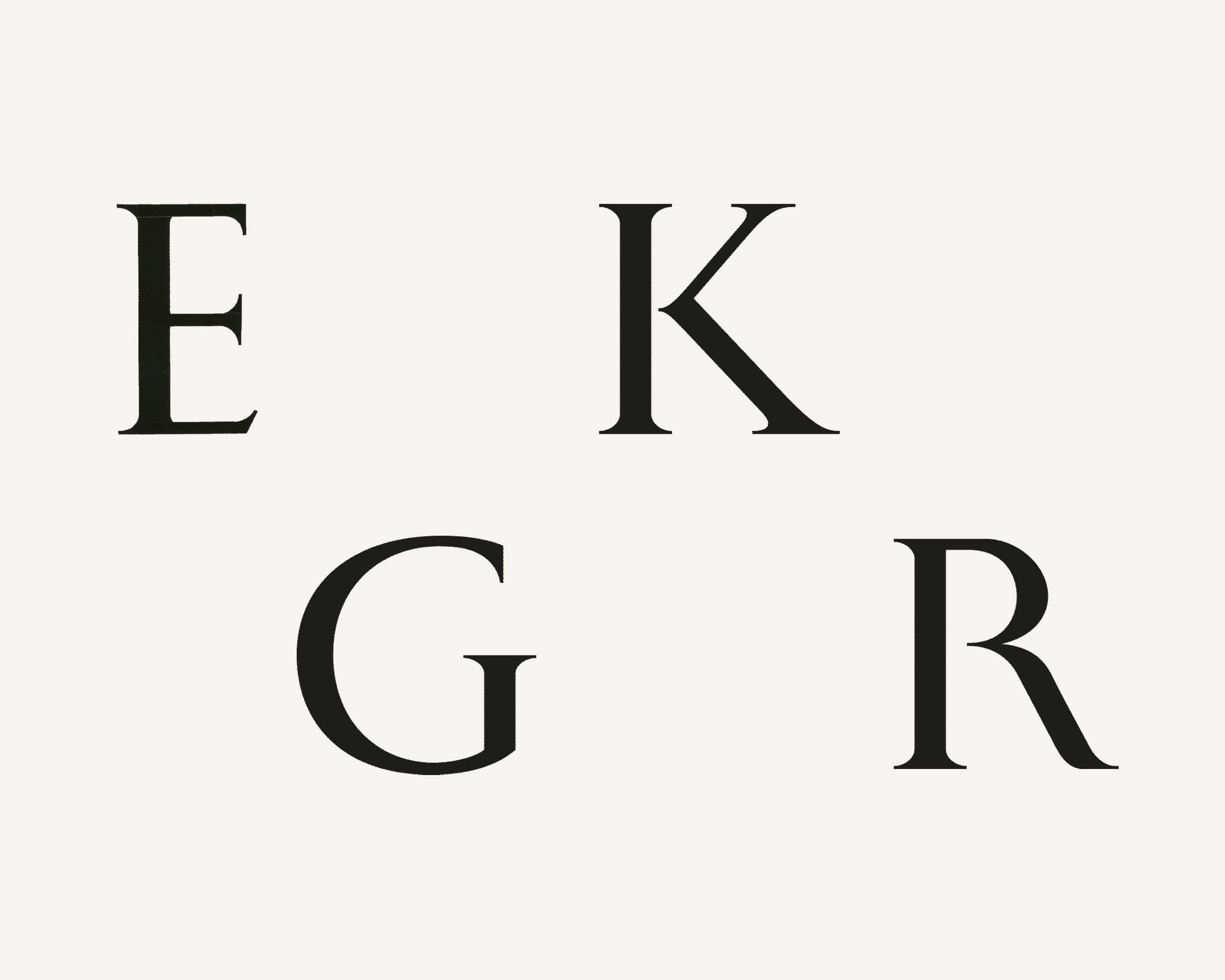
The font “Sy Roman” was inspired by the oldest serif form Roman font (engraved on the stone of historic sites and remains of Roma). Basically, it followed the shape of Roman, but has distinctive style in leg of R, and breaks the connection part of B, K, P, R.
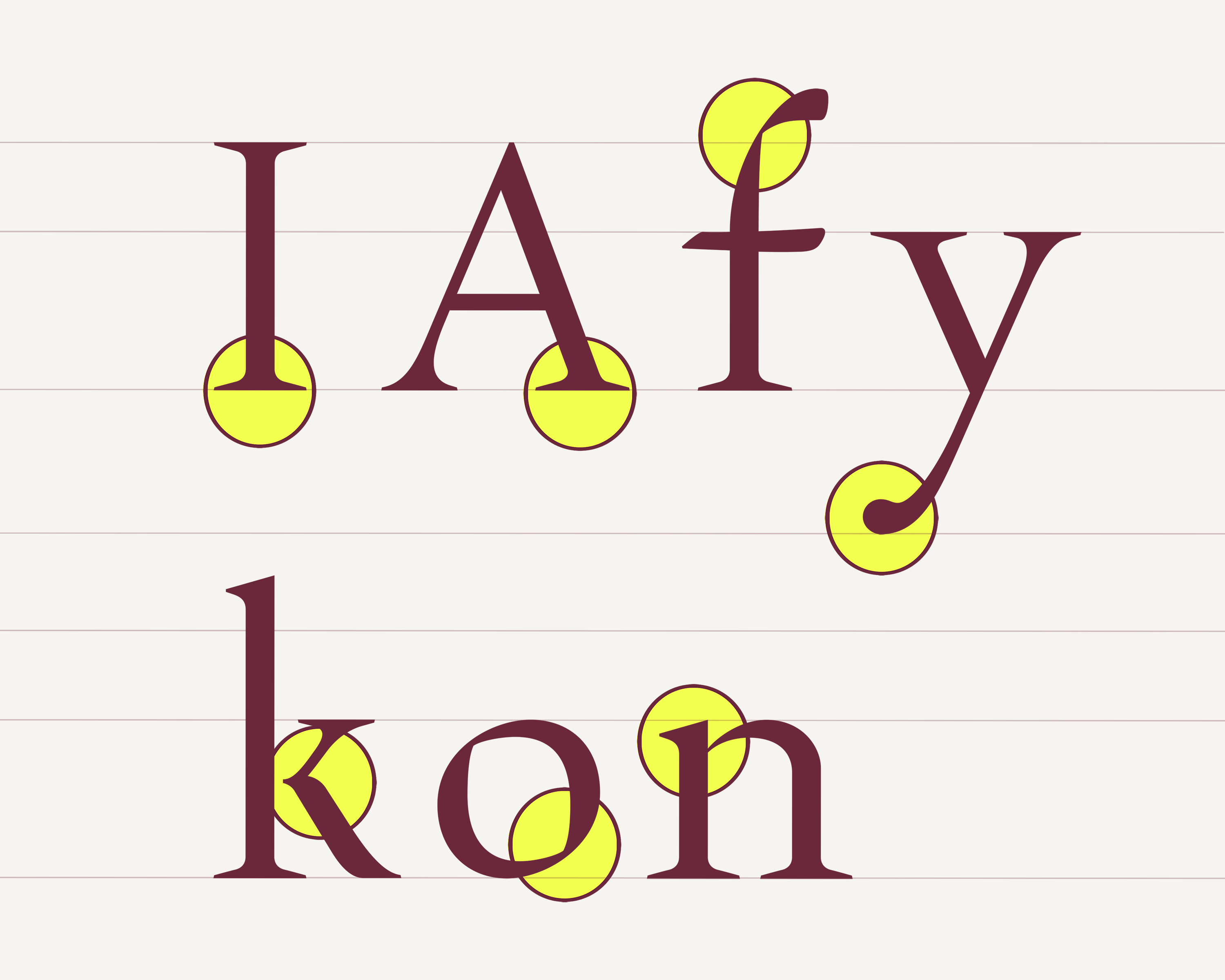
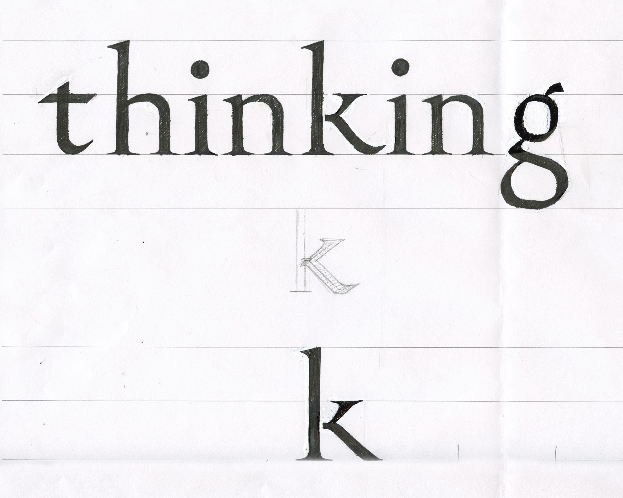
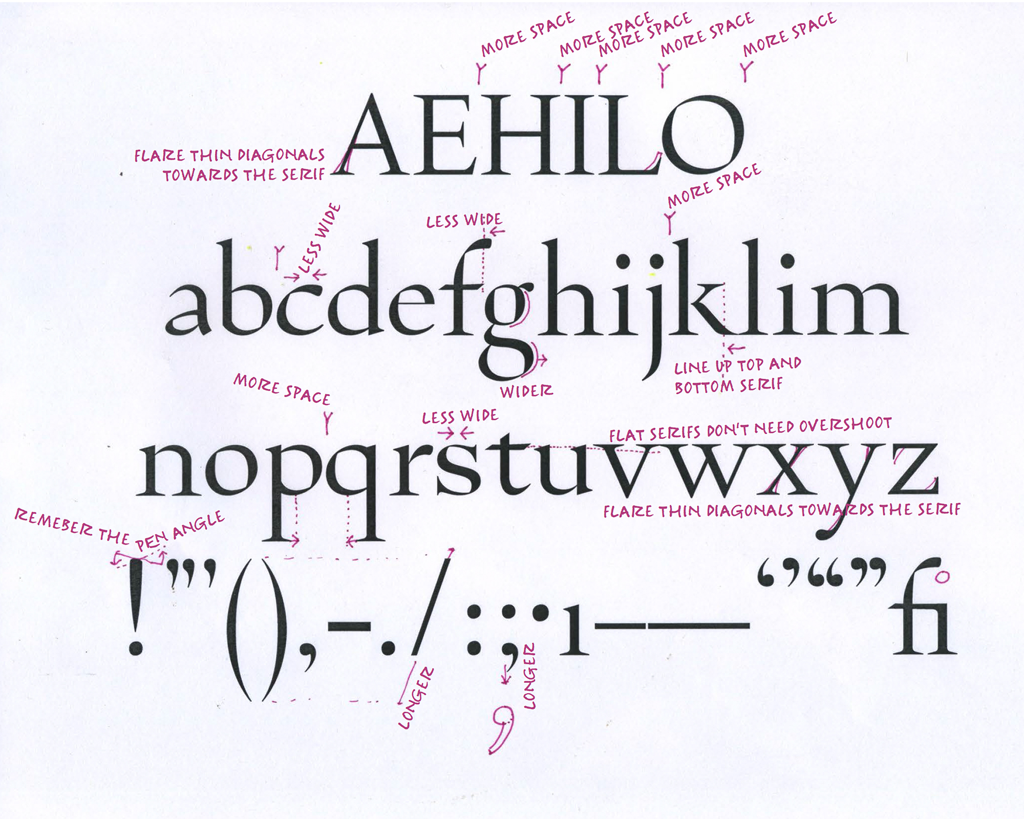
2. Sangserif
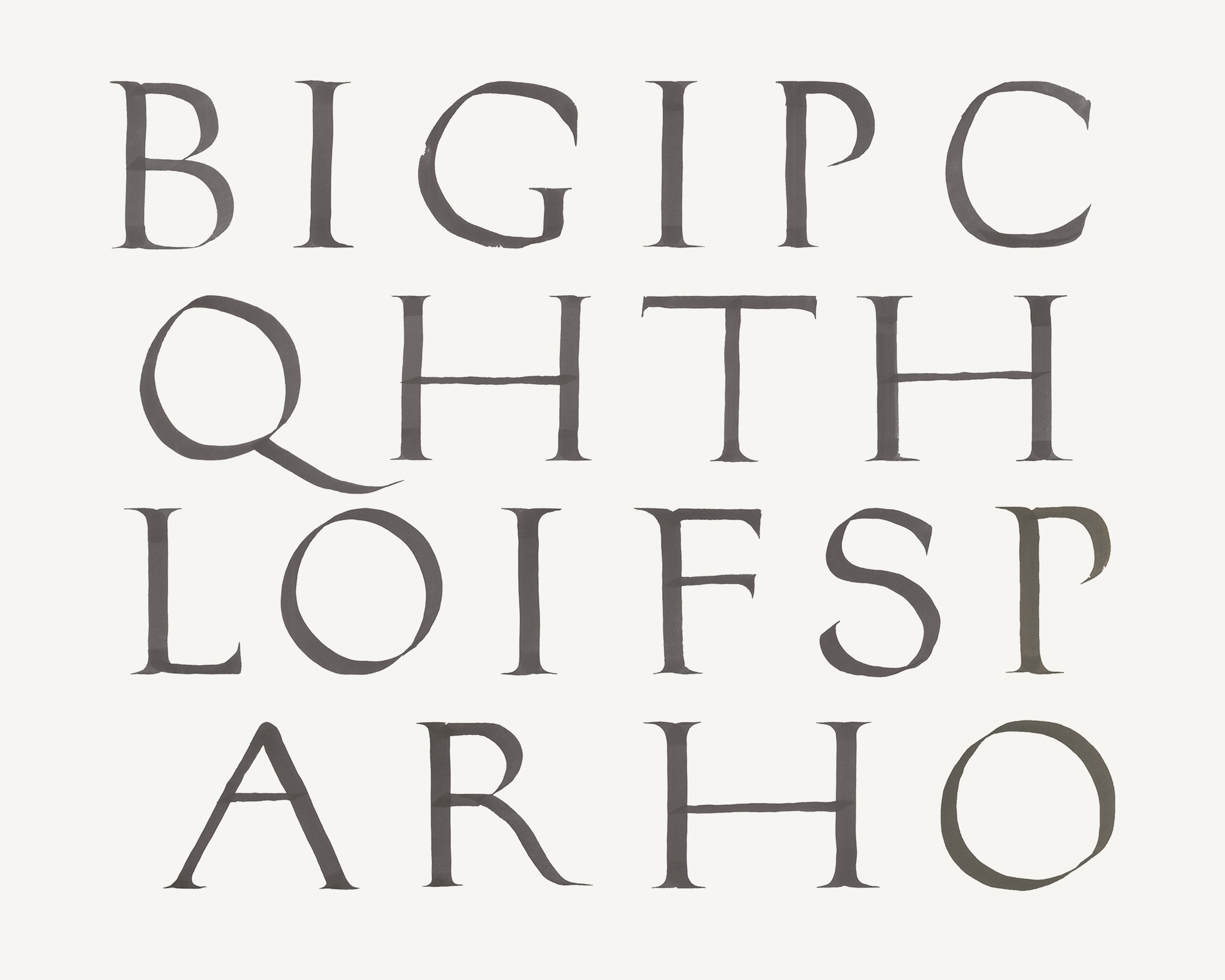
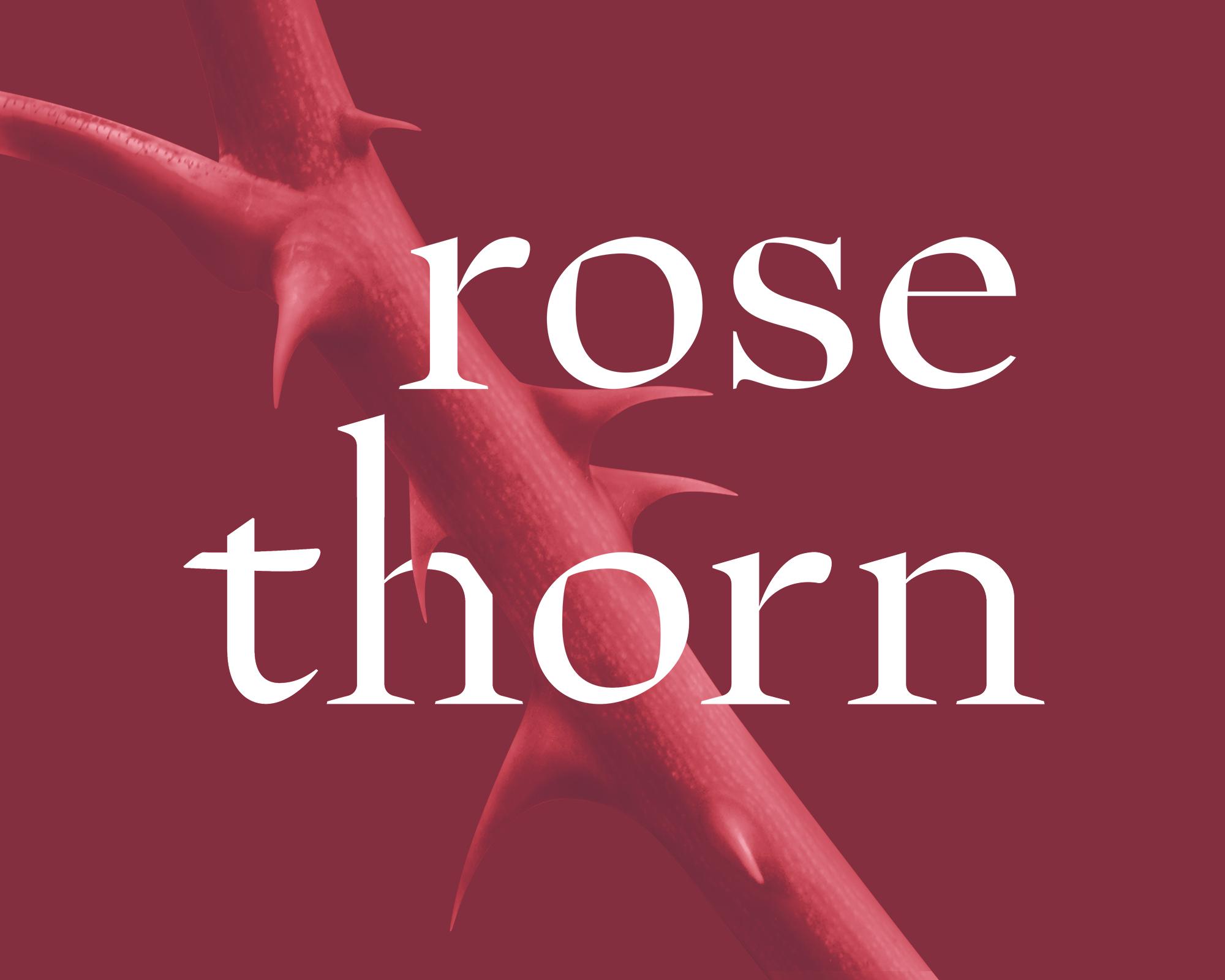
In the Font design lap, instructed by Hannes Famira, Sangyup learned about the system of a font. The font “Sangserif” is based on Sangyup’s handwriting, applying the system he learned. The serif is inspired by the rose-thorn shape. The font has low x height, the descender and ascender are longer than average, high contrast and serif form. “Sangserif” is optimized for body text and has excellent legibility characteristics.

